

Heineken | Star Pubs & Bars
Heineken needed post-pandemic, consumer loyalty data. I undertook the research and presented recommendations informed by the data and user testing.

Beacon | Beacon Ecommerce Platform
Beacon are one of the largest roofing suppliers in the USA. I helped them craft their as-is and to-be user journey maps.
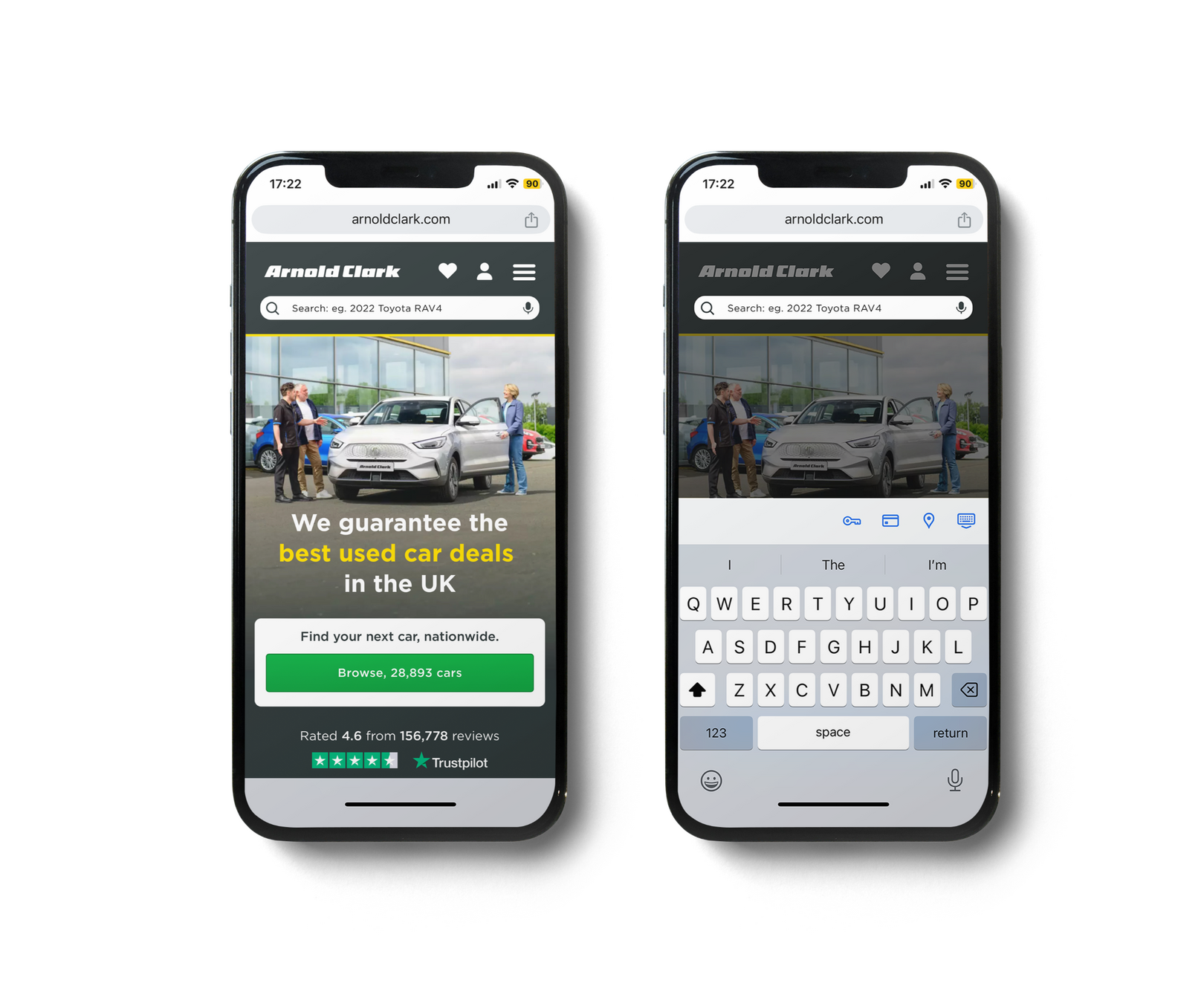
Arnold Clark | New & Used Car Retailer
One of the UK's largest car retailers asked me to examine the potential for free-key search capabilities on their website and present my recommendations.

Desk Hopper | Desk Booking App
Desk Hopper is an app for employees to book a desk in a busy office. I was involved from conception to post-build refinement and testing.

A11y | Accessibility Testing Platform
A11y is a platform used to perform accessibility audits of digital products and to generate recommendations inline with current WCGAG standards. I designed the app and branding, bringing a sense of fun to laborious but necessary tasks.
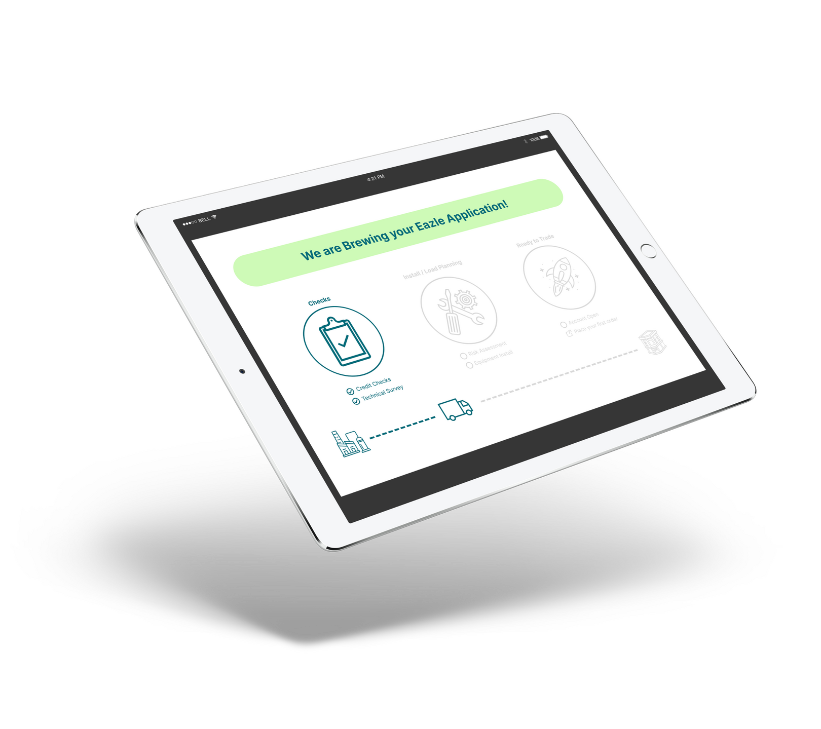
Heineken | Eazle Ecommerce Platform
Eazle is Heineken's publican-facing ecommerce platform where they can purchase drinks and accessories for their pub. I created consumer email visuals and performed a heuristic evaluation on their website and offered recomendations.
UX/UI CASE STUDY
ARNOLD CLARK | Ecommerce Platform
For an interview design task with one of the UK's largest car retailers, I was asked to examine the potential for free-key search capabilities on their website and present my recommendations.
XYZ CASE STUDY
CASE STUDY TITLE
Summary of what the product is.

MY RESPONSIBILITIES
First item
Second item
Third item
DELIVERABLES
First item
Second item
Third item
IMPORTANT ASPECTS
First item
Second item
Third item


THE PROBLEM
Summary of what the problem is.
THE CHALLENGE
Summary of what the challenge is.
WHO/WHAT ARE YOUR SOURCES TO WHEN GATHERING INSIGHTS?
Summary of who your sources.
ARE YOU SPEAKING TO USERS?
Summary of who you are speaking to.
POV - POINT OF VIEW
Summary of User Scenario
TOP COMMON PAIN POINTS DOING XYZ
First item
Second item
Third item
COMPETITOR ANALYSIS
Summary of what the analysis is.

SKETCHING IDEAS
Summary of what the sketch is.

USER FLOWS & MIND MAPPING
Summary of what you did.


WIREFRAME LOW FIDELITY
Summary of what the wireframe is.

ITERATION 1
Summary of iteration.

ITERATION 2
Summary of iteration.

FEATURE HIGHLIGHT
Summary of what the feature is.
THE DESIGN SOLUTION
Summary of what the solution is.

BRAND IDENTITY CASE STUDY
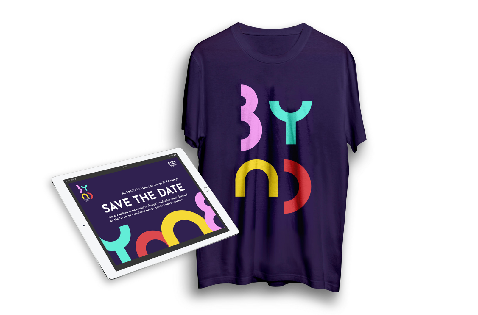
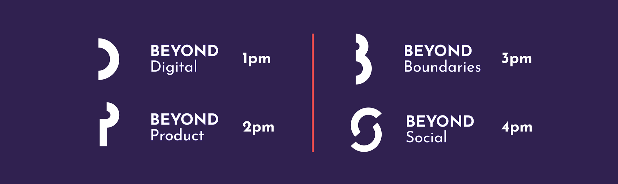
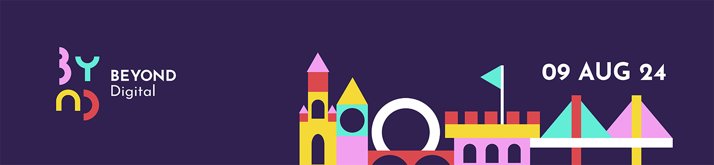
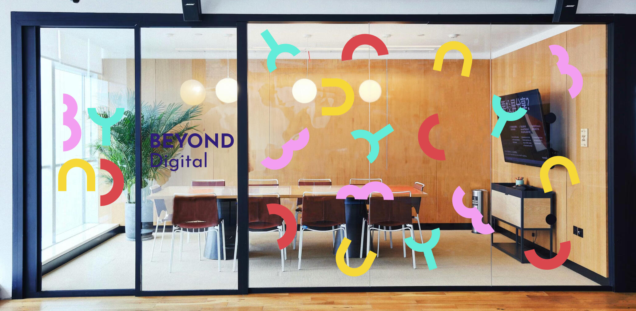
BEYOND DIGITAL | Thought Leadership Event
To promote their UX services, AND Digital hosted a thought leadership event for a vip guest list of current and prospective clients.
Role
Creative DesignerProblem
To entice new business, a digital agency needed a brand identity and branded assets for a new UX event.Process
Following the design thinking process, I conducted user research to understand the audience, developed initial concepts, and crafted a cohesive visual identity. Iterative prototyping, feedback loops, and refinement ensured alignment across all assets, fostering brand consistency. I created an impactful, forward thinking, professional identity that received excellent feedback.Business Outcomes
The event was well-attended, provided a unique experience and resulted in new client partnerships and business leads. The branding allows for scalability and flexibility for re-use when promoting future events.


The Brief
A digital agency were hosting an exclusive UX-focused event to attract potential clients and showcase its expertise in user experience innovation. The event highlighted the latest UX practices, offered networking opportunities, and presented real-world case studies during a Q&A with industry experts. It aimed to establish the agency as a leader in the field and convert attendees into future clients.The agency required comprehensive, scalable branding and promotional materials to appeal to the target audience of decision-makers at medium-to-large businesses seeking innovative UX solutions.MVP
- Event Branding including a distinctive event logo and visual theme that complemented the agency’s existing identity while giving the event its own unique character.
- Digital Assets comprising of a visually appealing digital e-vite with compelling copy, email banners for pre-event promotions and post-event follow-ups and social media graphics, including posts, stories, and event cover images.
- Event Merchandise such as tote bags, t-shirts, and lanyards that reflected the event’s theme and served as lasting reminders for attendees.
My Role | Creative DesignerHighlight | My design was chosen & developedPain Points | Time, Budget, Absent stakeholdersLearnings | Iterative process relies on timely feedbackSuccess | This brand identity provided the client with enhanced visibility, audience engagement, and strong differentiation from competitors. It built trust and credibility, facilitated effective marketing strategies, and created a memorable experience for the attendees.The event was well-attended with guests praising the engaging presentations and interactive workshops, which highlighted the agency’s innovative approach to user experience design. The event fostered meaningful connections, with 100% of attendees engaging in the post-event networking session. As a result, the agency secured new client partnerships and generated numerous promising leads. Branded merchandise and digital materials received overwhelmingly positive feedback, reinforcing the event's professional and forward-thinking image. By blending education, collaboration, and creativity, the event positioned the agency as a trusted leader in UX, paving the way for future growth.Future Development | Increased budget would allow for event decor ideas to come to life, including a photo wall to encourage attendees to share images on social media.

The Design Thinking Process

User surveys were conducted with potential attendees to understand their needs, motivations and challenges in UX and what they value in events.Insights gathered from the agency's business development team allowed me to align event goals with business objectives.Personas were created that represented the target audience, focusing on their goals, preferences, and pain points.
Problem Statement
“Decision-makers need an engaging and insightful event that demonstrates the value of UX in driving business outcomes.”Identified key goals such as generating leads, positioning the agency as a thought leader, and delivering a memorable experience thus confirming a focused direction for the event, ensuring all designs align with user and business needs.

Brainstorming Session
Explored various visual themes, taglines, and concepts for the event.Concept Sketching
Drafted initial ideas for logos, digital materials, and merchandise.Idea Validation
Gathered feedback from stakeholders on initial concepts to refine ideas to form a shortlist.
Based on the pre-chosen event name 'Beyond Digital', I created mind maps containing words and phrases that came to mind when thinking of what we wanted to achieve.

I initially drew inspiration from space travel and exploration and ideated various logo designs within that theme, adhering to the stakeholders' Neo Modernist mood board. This was one initial concept:
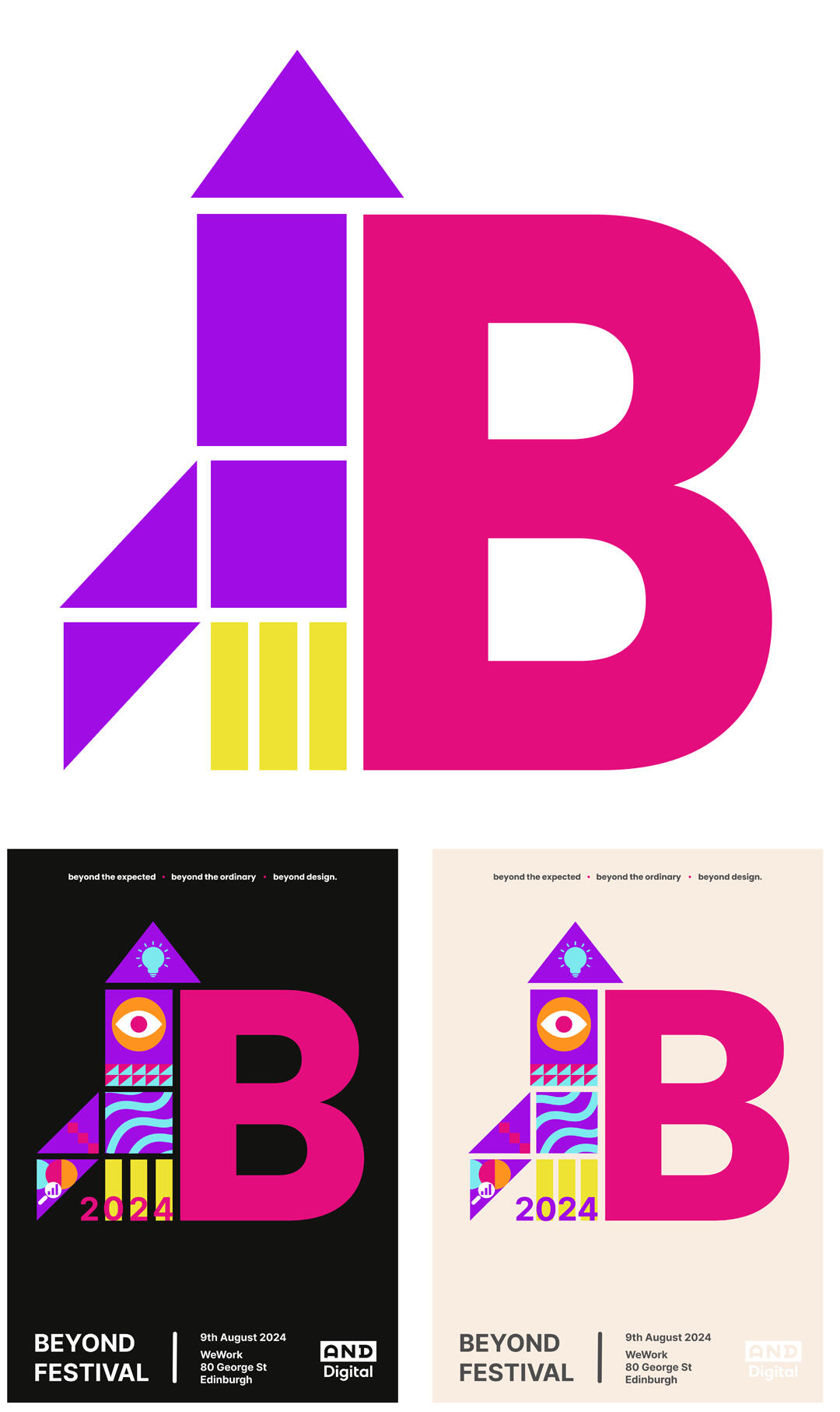
Due to stakeholder absence, the design team made the decision to move forward with the space theme, creating developed assets to show the stakeholders on their return. Feedback was good for the above design, but it was thought that the rocket was too 'on the nose'.I went back to my inspiration imagery I had collated and was excited by the nostalgia of the brightly coloured, geometric building blocks that children use to create houses, bridges and... rockets!

Inspired by these building blocks, I created an entire new font utilising a handful of simple shapes rotated and resized to create the different letters. These letters could be used in a variety of impactful ways and allowed flexibility and scalability in terms of developing more assets in the future.I created the Edinburgh skyline (the city in which the event was taking place) from these same shapes as an extra design asset for banners and e-vites.

Digital Mockups were created of the event logo, e-vite, email banners, and social media graphics.Merchandise Mockups such as t-shirts, badges, tote bags and notebooks.Physical Mockups including schedules, posters, roller banners, Q&A cards and workshop activity props.
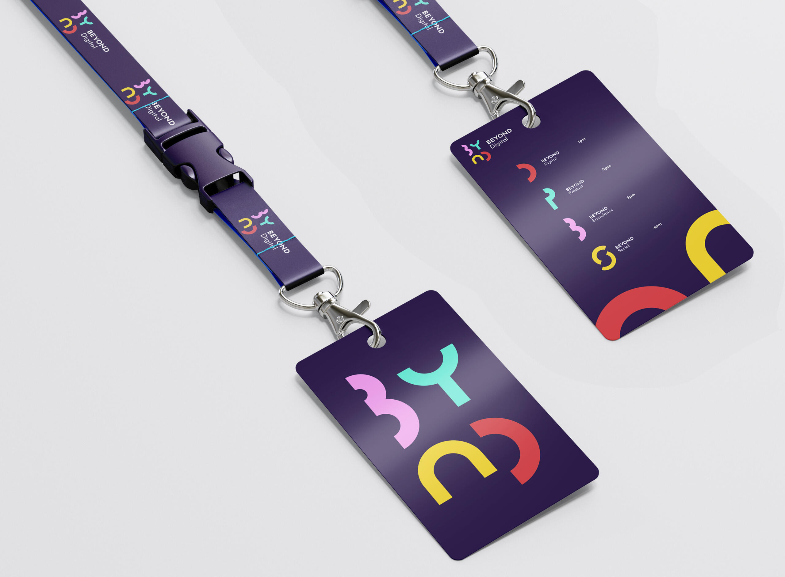
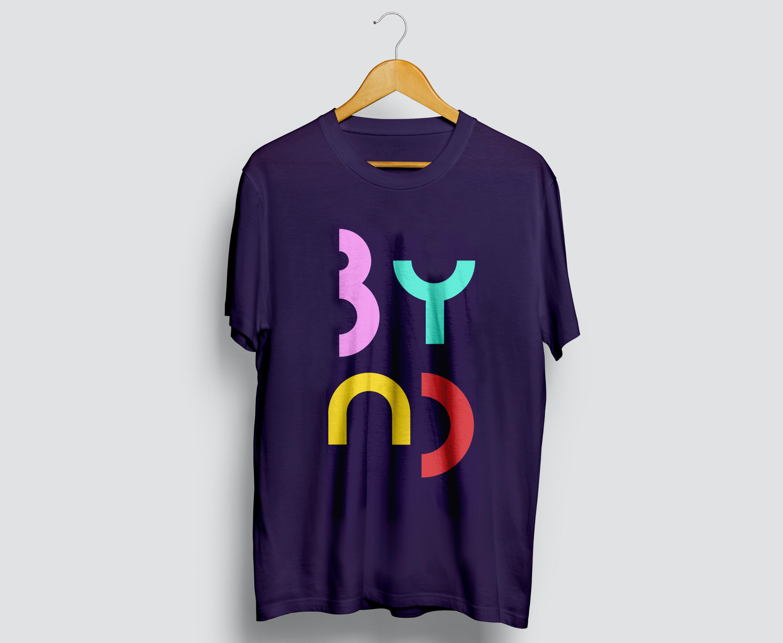
"I want that t-shirt" - Fiona Burton, CEO, AND DigitalMockup feedback was received by sharing mockups and merchandise with a test audience of selected stakeholders.Aesthetics feedback was collected on design usability and relevance.I iterated based on feedback refining colours, typography, layout, and messaging as needed.
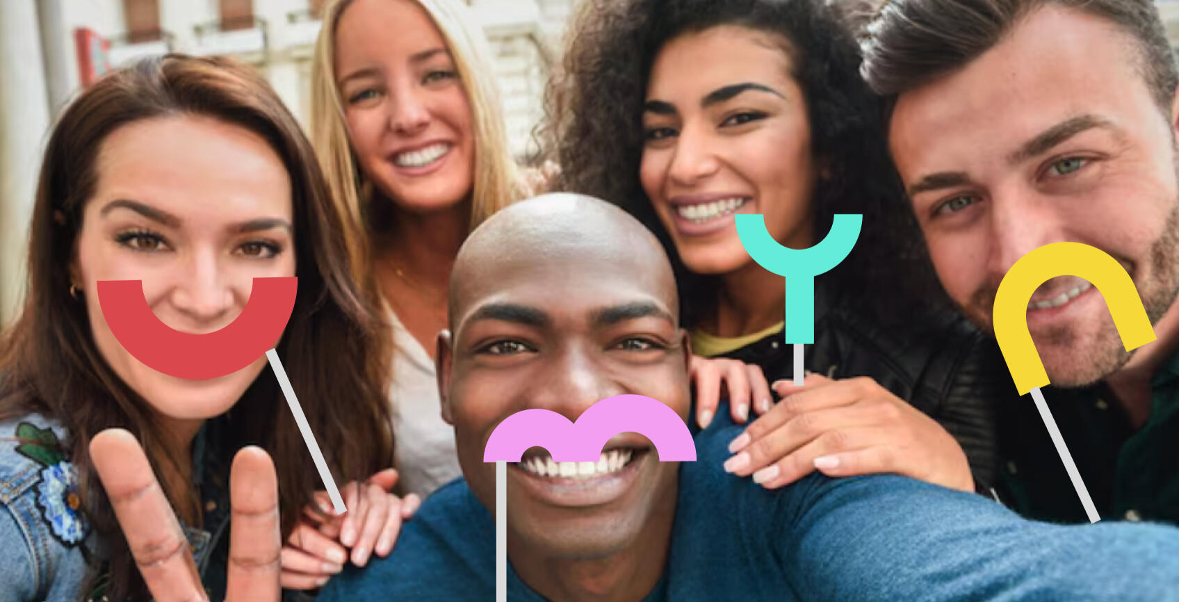
As well as the expected designs, as an extra delight piece, event decor was also produced including large vinyl lettering and logo for the venue windows and fun photo booth style props encouraging attendees to share photos on social media.

Produced and distributed e-vites, email communication using email banners, and liaised with manufacturers to get merchandise made.Launched the branding across digital channels (social media, email campaigns, and event platforms).Monitored engagement metrics and attendee feedback to measure success.
PRODUCT DESIGN & UX/UI CASE STUDY
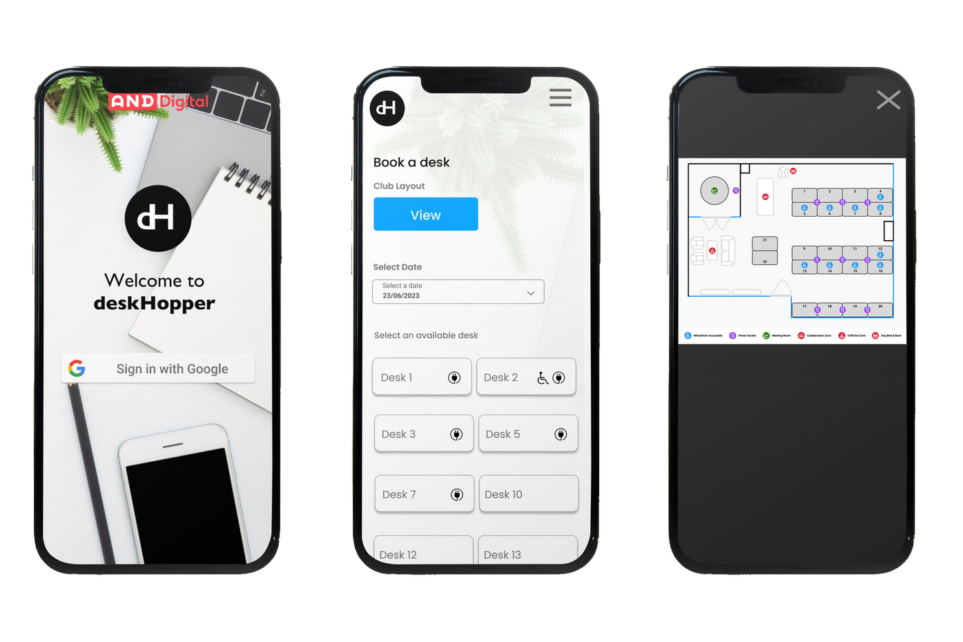
DESK HOPPER | Desk Booking App
Desk Hopper is an app for employees to book a desk in a busy office.
Role
Lead Product DesignerProblem
Employees required a digital method of booking a desk in a busy office.Process
I was the sole designer involved in the entire end-to-end process. Utilising design thinking, I empathised with the user by creating personas and tested prototypes with the actual employees who would be using the product, iterating as required.Business Outcomes
The office saw increased productivity as less time was spent looking for a desk, an increase in desk utilisation and an uptick in employee satisfaction. The resulting app was a huge success and has been rolled out to other offices in the organisation.

The Brief
Employees had no method of booking a desk in their office. A mobile-friendly desk booking app showing real-time desk availability was required for a busy office space. The app should enable employees to easily find and reserve available desks, prior to entering the office, ensuring a smooth, organised workspace while minimising conflicts over desk availability.MVP
- User profile and booking management
- Real-time availability
- Desk plan and office layout
- Users should be able to reserve desks by 1/2 day slots
- Users should only be able to book 1 desk per 1/2 day slot
- General office information
- Users can toggle their anonymity
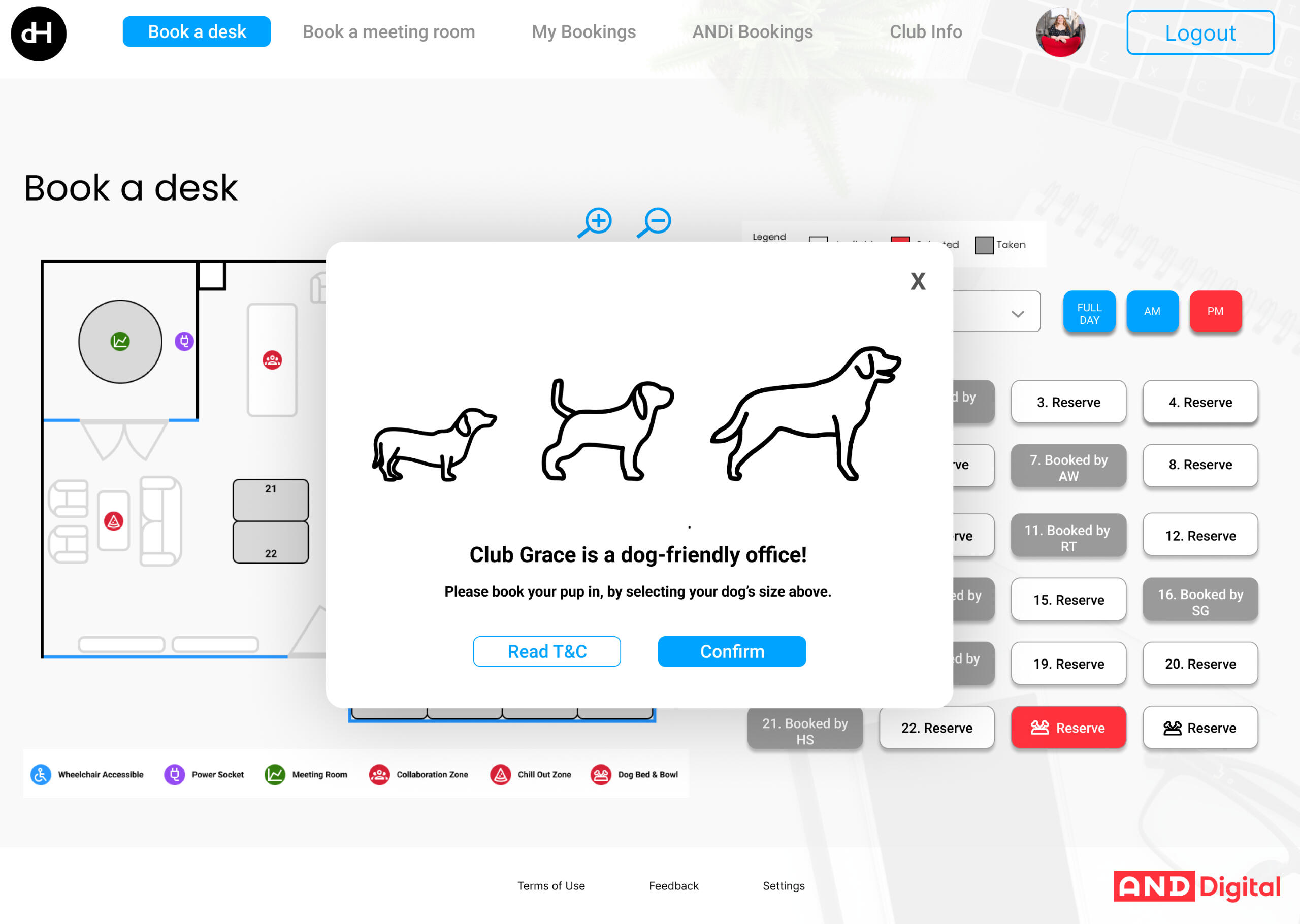
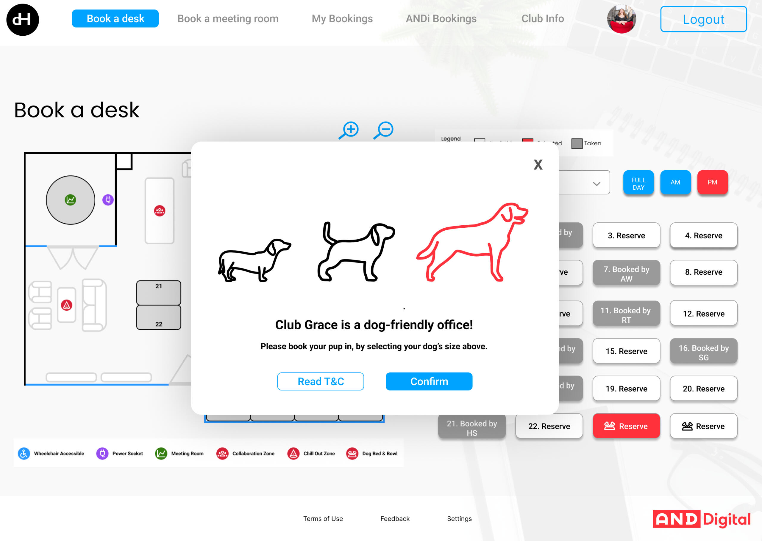
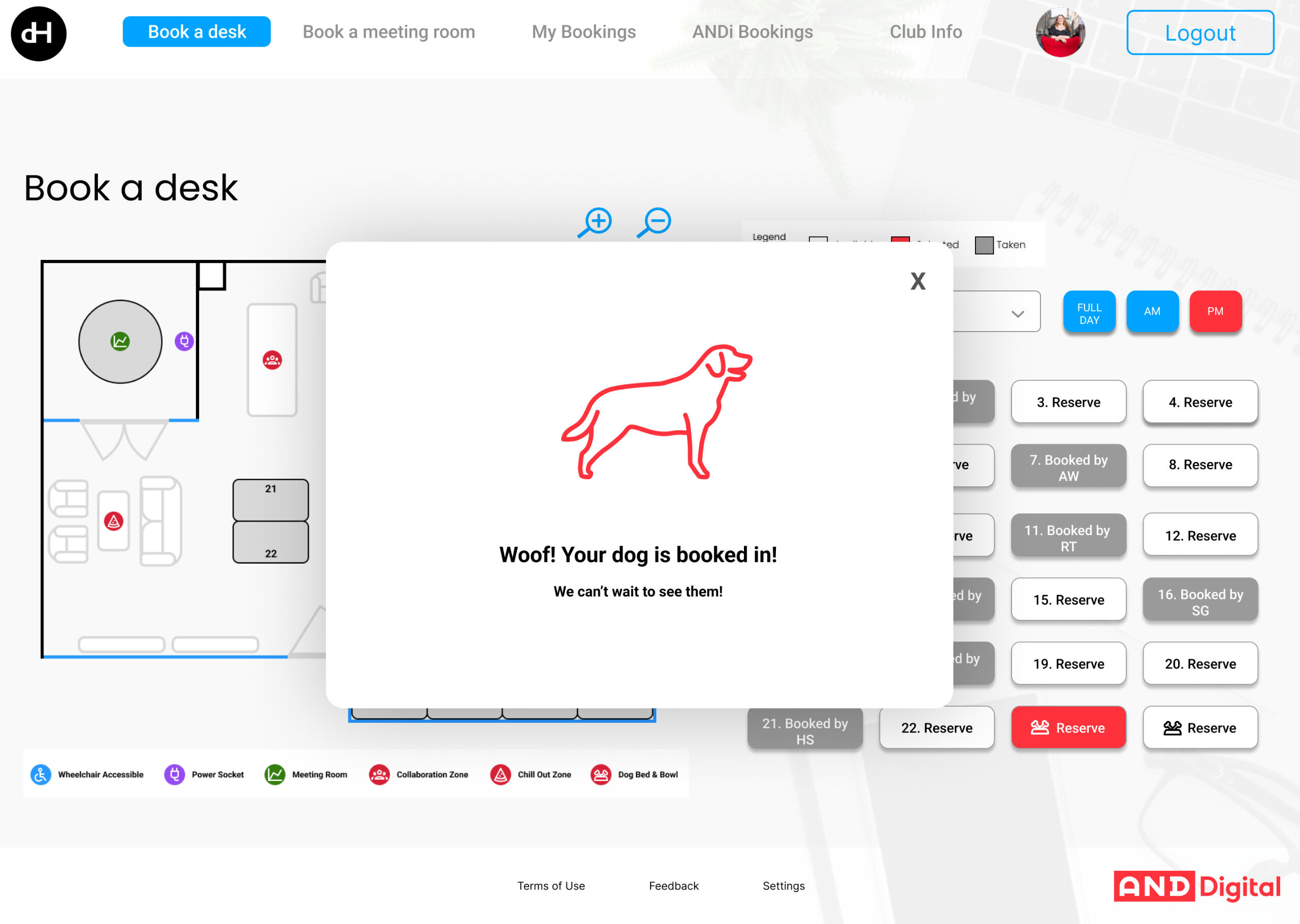
- Users can book their dog into the office provided they have already booked their own desk
My Role | Lead Product DesignerHighlight | I was involved in the entire end-to-end process from initial discovery until delivery.Pain Points | Time, budget, devs changing design due to personal preferenceLearnings | Increased communication with devs and presented findings from research and evidence of best practise methods to show why the design workedSuccess | This app was rolled-out across other offices within the organisation. Due to the design adhering to the company brand guidelines, it allowed the app to sit seamlessly within the company's internal product ecosystem. The app saw an increase in employee productivity as they weren't wasting time looking for a desk. An increase in desk utilisation was seen as employees were more likely to attend the office if they were guaranteed a booked desk. When surveyed, employees gave a 100% satisfaction score when booking a desk using the app.Future Development | A metrics dashboard is required to spot trends and challenges.
The Design Thinking Process

User Interviews were performed to discover:
- Common frustrations with existing process
- Daily routines and factors influencing desk selection (e.g. accessibility access, equipment needs)
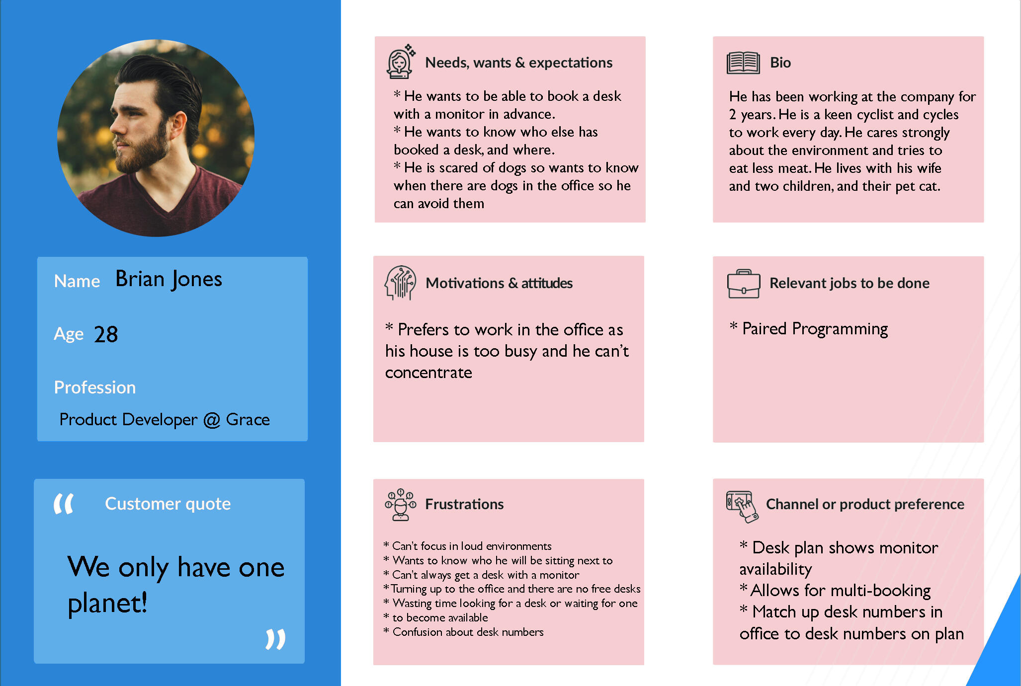
- Preferences for desk layout, privacy, and access to office resourcesSurveys were conducted to gather quantitative data on usage frequency, peak office times, and types of desks preferredUser Personas were developed representing various user types, such as:
- Everyday Worker: prefers to be office based over remote
- Remote Worker: Comes in 1-2 times a week and has a preferred desk
- Team Leader: Needs to book desks for the entire team or a meeting room
- Worker With Accessibility Needs: Wheelchair using worker requiring extra space to manoeuvreA Competitor Analysis was performed to understand standard functionality that a user would expect, and also to see what innovative features other brands were offering and to determine any gaps.

Problem Statement
I developed a concise problem statement:
"Office employees need a reliable, intuitive way to reserve desks that accommodates varying schedules and preferences to improve workplace efficiency and comfort."User Journey Mapping
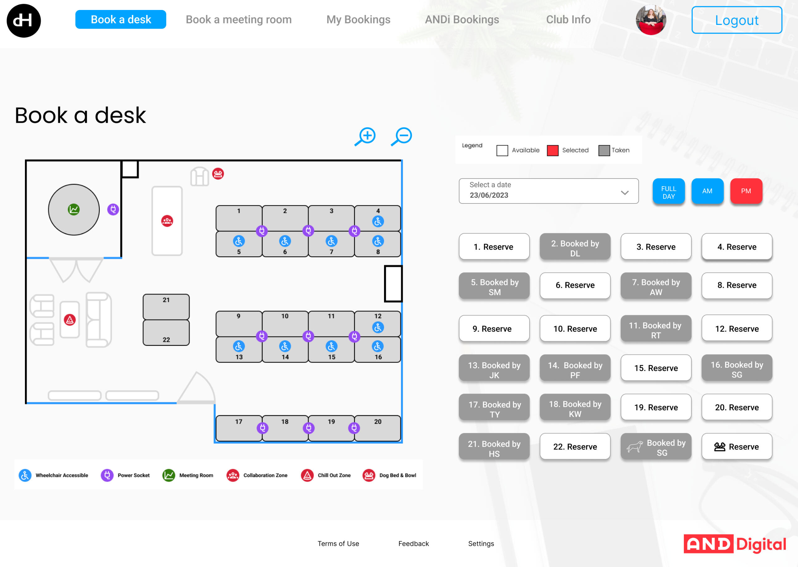
I created the as-is and to-be user journey maps of a user booking a desk, from checking availability to arriving at the office, and identified pain points, like lack of visibility into real-time desk occupancy and lack of clear desk attributes.Define Key Requirements
Essential features were identified, such as real-time availability, desk attributes (e.g. with monitors, plug points or standing desks), team seating options and cancellation features.

Brainstorming Session
Generated ideas for different ways users can interact with the app, such as:
- Interactive, clickable visual seating maps for easy desk selection (like airline seating plans).
- A 'Favourites' feature for users to save preferred desks.
- Team booking options where managers can reserve desks for groups.Crazy 8s
Rapid sketching of different app screens and flows to explore variations in desk search, selection, and booking processes.Feature Prioritization
Used techniques like MoSCoW (Must have, Should have, Could have, Won’t have) to prioritise features that offer the most value.We also created
- mind maps
- mood boards
- branding sketches

Paper Prototyping
I began with low-fidelity sketches of key screens, like the home screen, desk map view, and booking confirmation, to quickly test layout ideas.Wireframing
A wireframe was developed that layed out the app’s navigation and screens, such as:
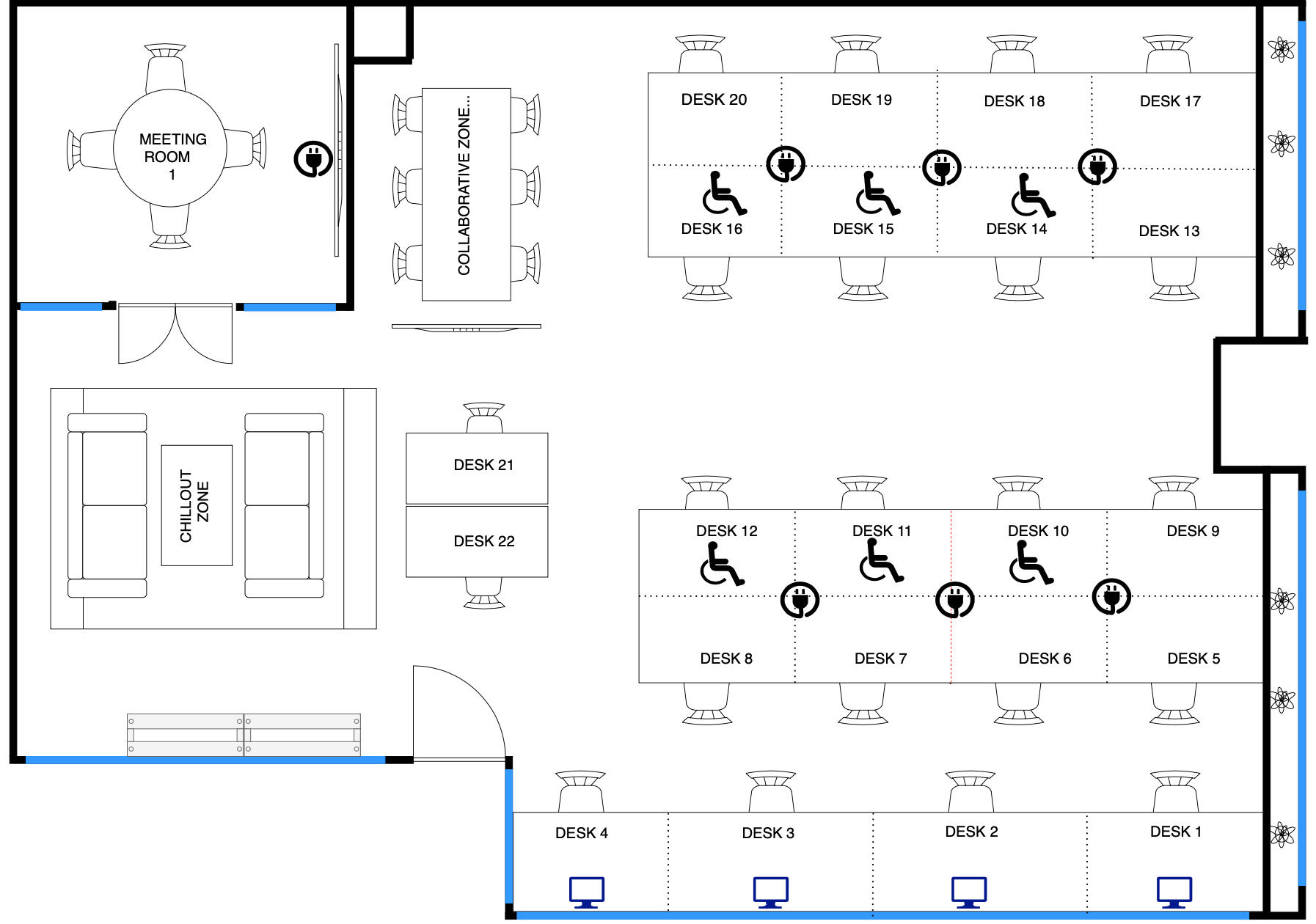
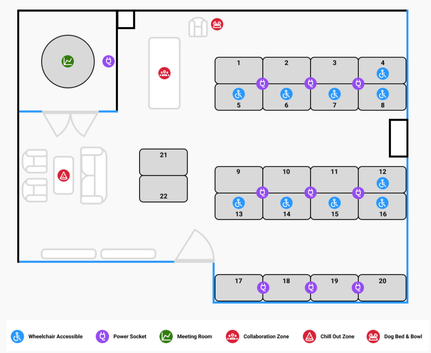
A dashboard for viewing real-time desk availability.
Icons to show desk options (e.g. desks with monitors, plug points or wheelchair accessible desks)
A calendar view for booking future dates.Interactive Prototype
Using Figma I created a clickable prototype with more detail, including interactions for checking availability, viewing desk details, and completing bookings.Additional features informed by the research included:
- half day bookable slots
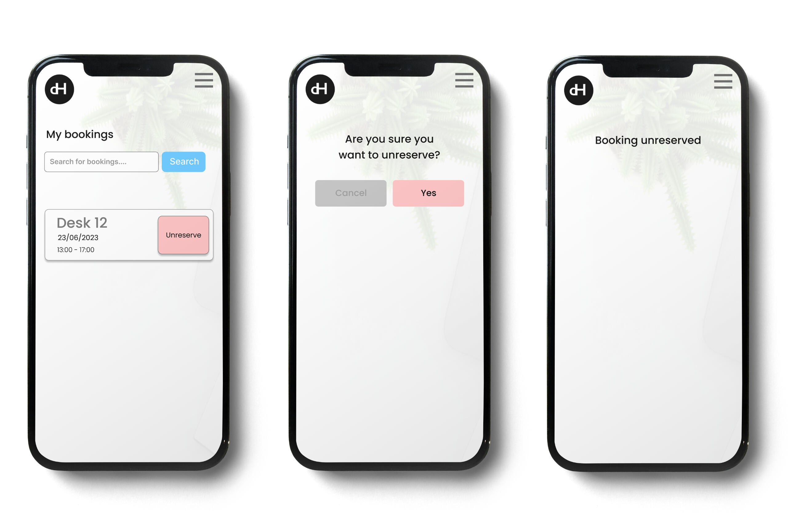
- a 'My Bookings' page showing all bookings with the option to edit individual bookings
- an 'about the office' page including important office information
- option to bulk book desks and meeting rooms
- publicly show employee initials on booked desks with the ability for the user to toggle on/off their anonymity to allow/prevent other users seeing where their booked desks were located.
- Booking dogs into the office and being able to see if other dogs are booked in.

Usability Testing
I invited office employees to perform tasks, like booking a desk for a specific date or finding a specific desk type. I observed and took notes on any struggles or confusion.Feedback Collection
Conducted post-test surveys to collect feedback on ease of use, preferred features, and any missing functionality.I iterated Based on Feedback
Used insights from testing to refine the prototype. For example, it was found that monitors and keyboards were moved around the office and it could prove difficult to guarantee their availability despite booking. I also improved labelling and added icons to make desk options clearer.
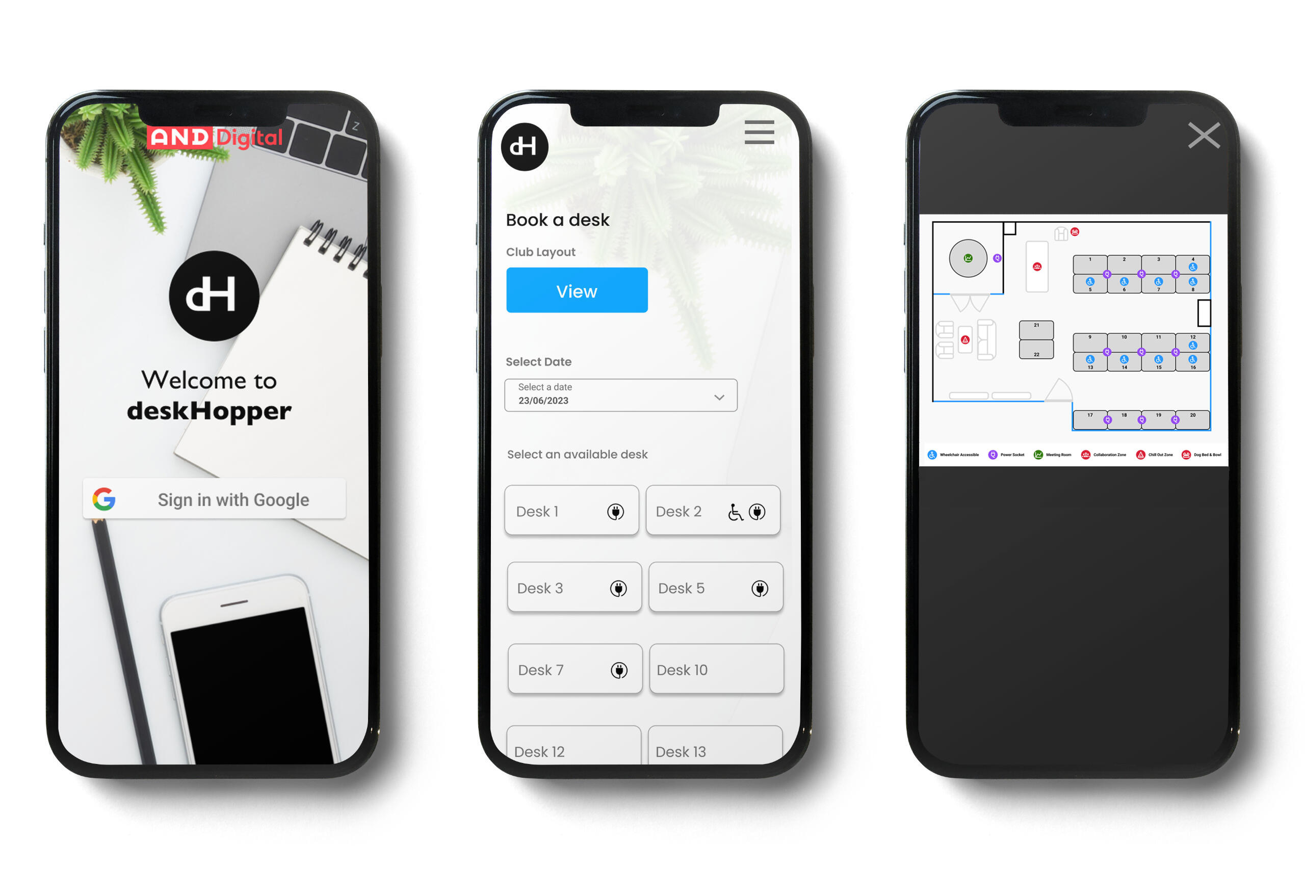
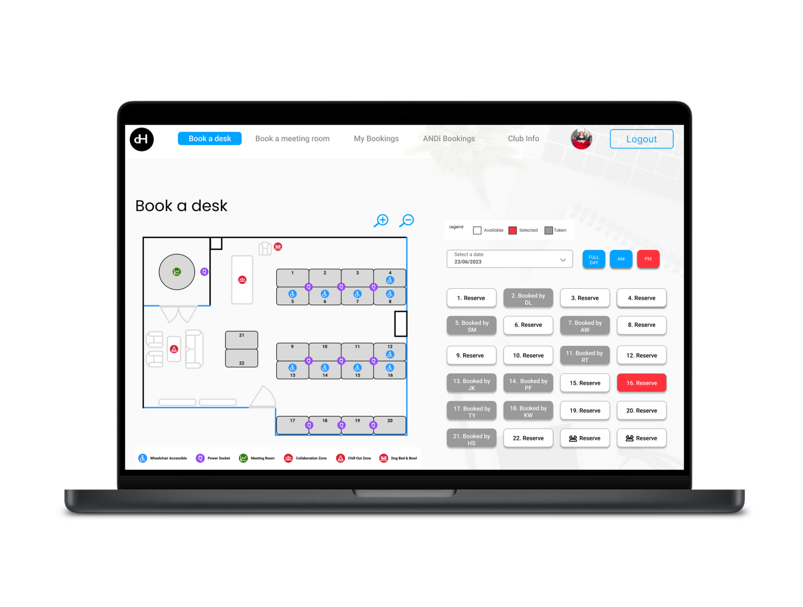
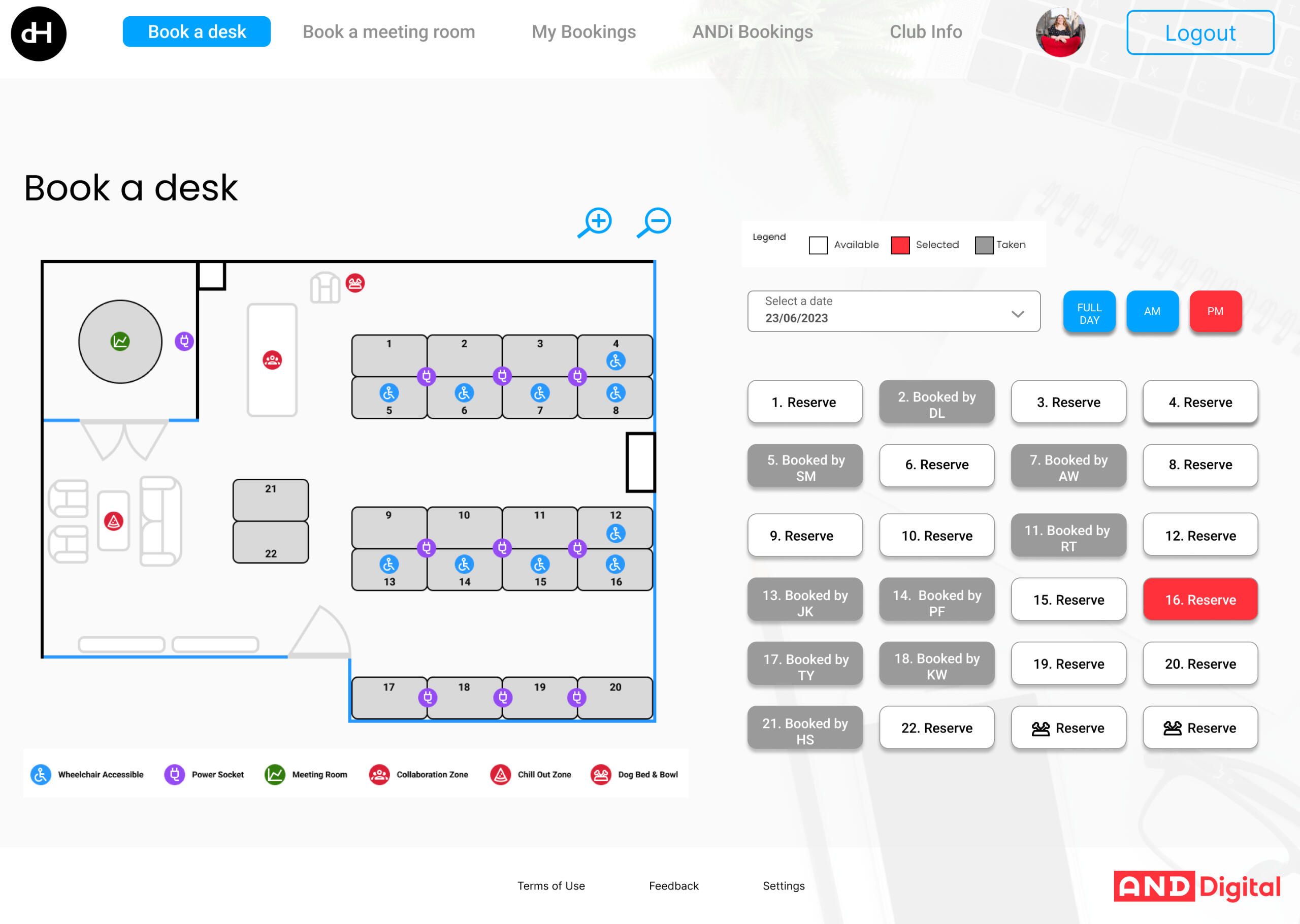
Desk Plan
As the main focus of the booking page would include a desk plan, I hosted a design sprint with the team to ideate how that desk plan should look, and the features it should include. It was decided the MVP should be a static, non-interactive desk plan, with clickable functionality to be added in the future.
Pupdate
The office was dog-friendly. However, our research findings showed that there were some users who were uncomfortable around or allergic to, dogs. Although these were edge cases, we wanted to make our booking system inclusive to all. Therefore when designing the UI allowing users to book in their dog, we wanted other users to be able to see if there were any dogs booked in and who they belonged to, so they could make an informed decision. Below shows that journey.
BRAND IDENTITY CASE STUDY
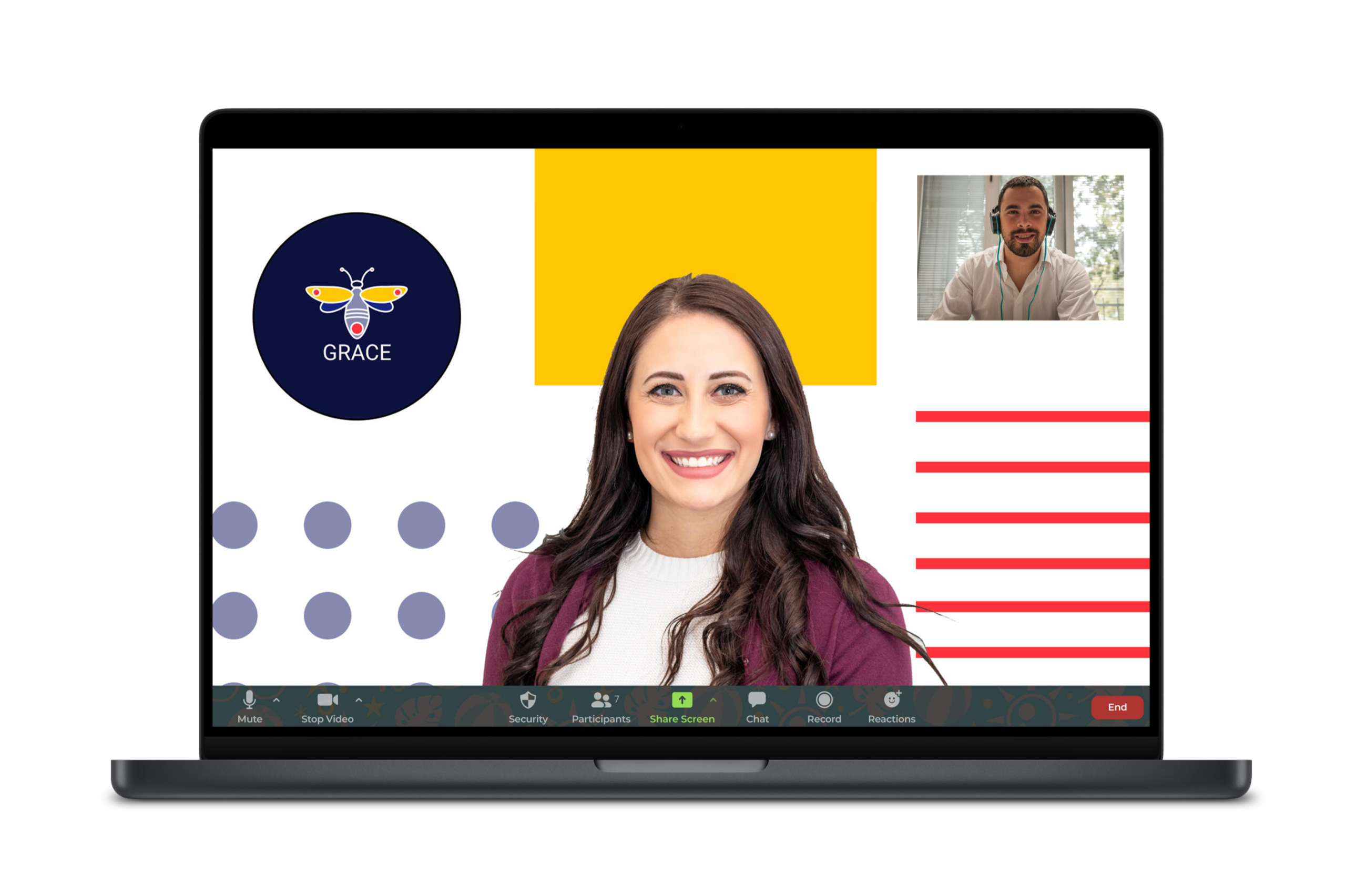
CLUB GRACE | Office
Club Grace is the Edinburgh offices for AND Digital, a digital agency.
Role
Lead DesignerProblem
An office requires a new brand identity to motivate and inspire employees and to increase trust and credibility with clients, after company wide challenges.Process
I was the sole designer involved in this project. Using design thinking, I empathised with employees and clients to understand needs, defined the rebrand’s goals, and ideated creative concepts for logos, templates, and backgrounds. Prototypes were tested for feedback, ensuring designs inspired team pride, engage clients, and reflected innovation. Final assets were refined and implemented effectively.Business Outcomes
The rebrand enhanced client perception, positioning the office as innovative and professional, while boosting employee morale through stronger team identities. Clear, cohesive visuals improved communication efficiency, fostered pride, and reinforced unity. Ultimately, this will strengthen client relationships, drive engagement, and support long-term business growth and retention.
The Brief
An office within a larger organisation, needed a fresh, standout brand identity to captivate clients and reinvigorate internal morale following recent redundancies. This included designing a cohesive master brand logo and sub-logos for employee teams, ensuring alignment yet distinction within the hierarchy.The identity should reflect professionalism, collaboration, and innovation while fostering team pride and unity. The designs should be flexible, modern, and representative of office values.MVP
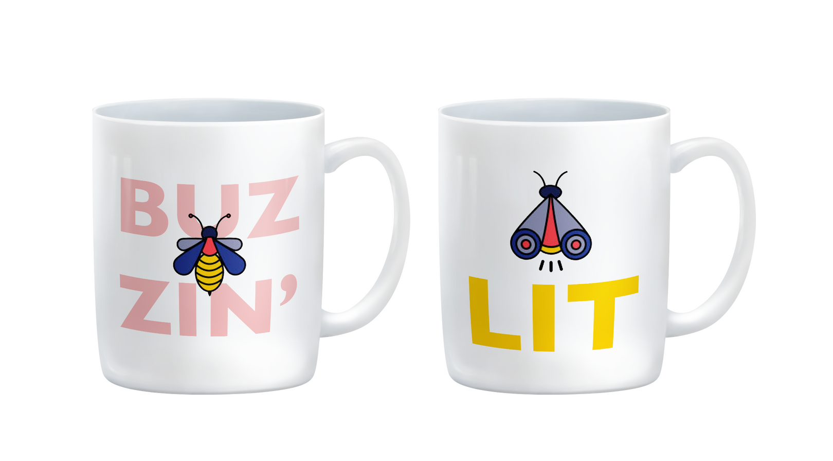
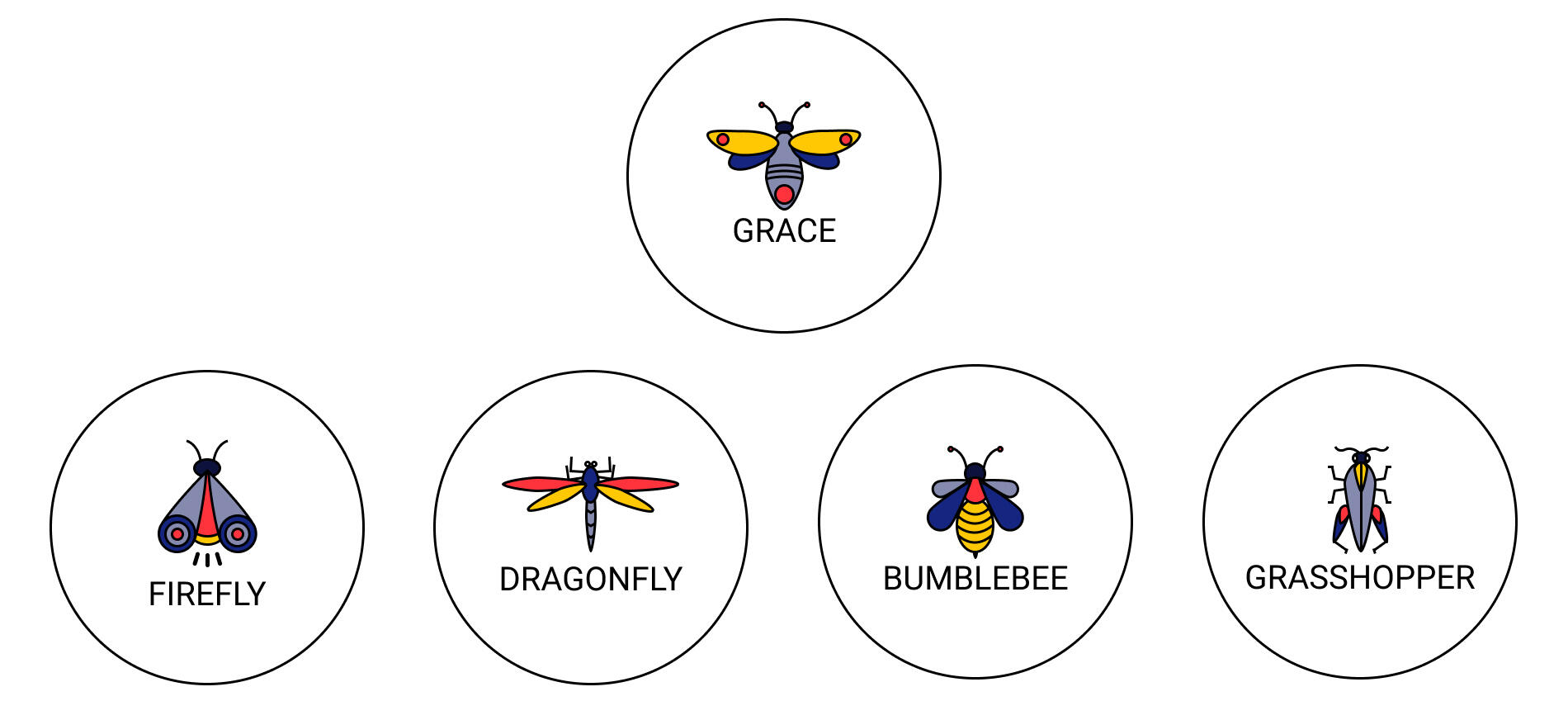
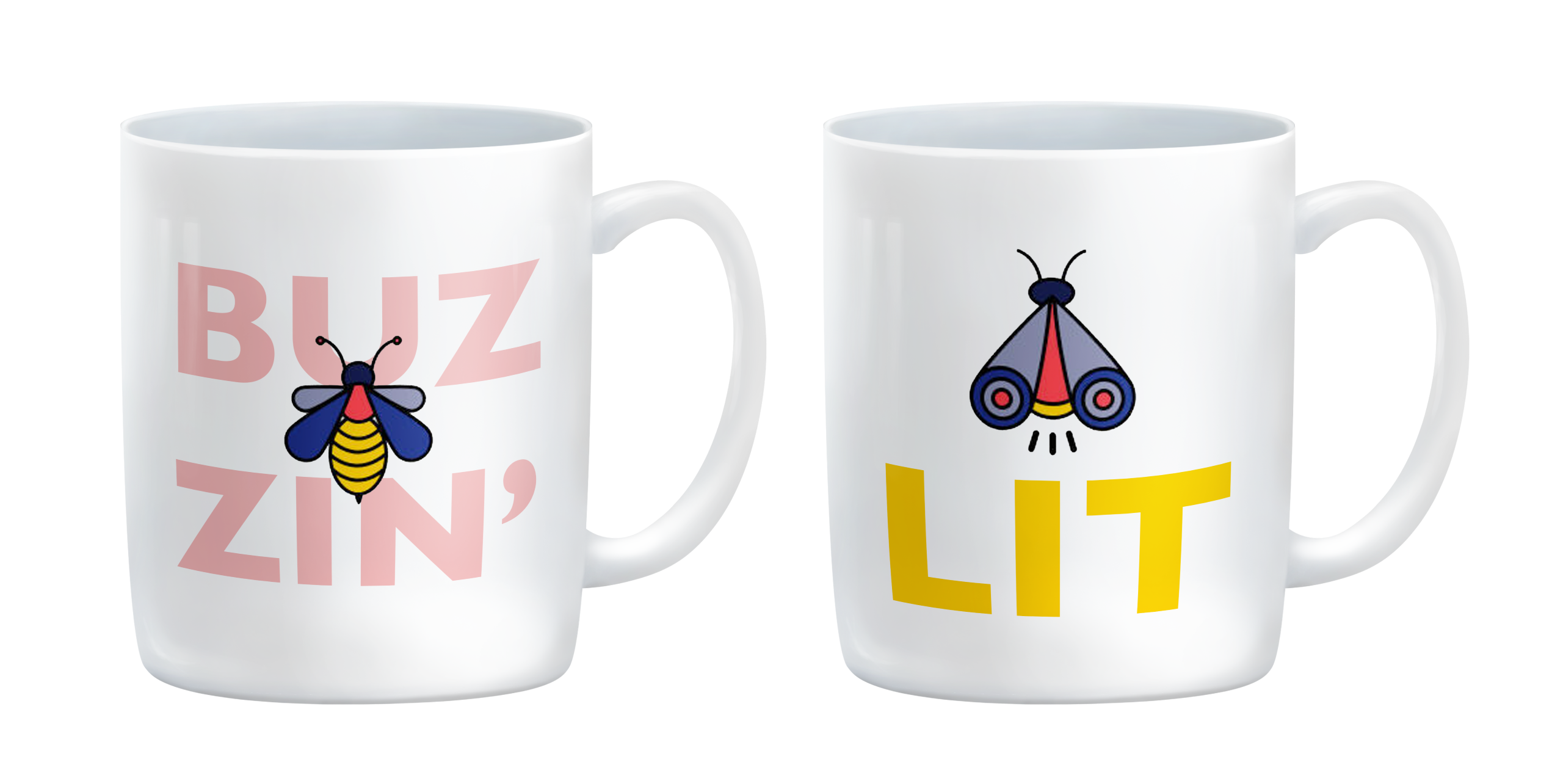
- Master-brand Club Grace identity and sub-brand employee team identities
- Logos
- Google slide templates
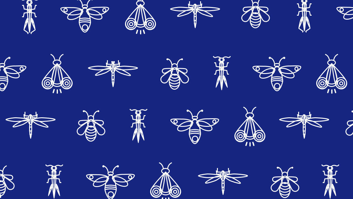
- Repeating Pattern
- Google Meet backgrounds
- Merchandise
My Role | Lead DesignerHighlight | Seeing the slide templates being usedPain Points | One person team, lack of feedback from stakeholders, no access to clients for testingLearnings |Success | The Club Grace brand sought to bring employees together, boost morale and signify a fresh start, creating a culture of resilience and adaptability. This rebrand would show clients that Club Grace was consistent, innovative and had a strong sense of who they were. Within a larger organisation, an office that rebrands itself can differentiate its offerings or identity. This can be especially important if it needs to stand out to attract resources or show unique value to the rest of the organisation.Future Development | It would be beneficial to A/B test slide designs with clients. Further expansion of assets including branded client gifts, email signatures, google form banners, office decor such as signage, motivational posters and laptop stickers would further improve on in-office employee morale.
The Design Thinking Process

Conducted interviews with employees to gather insights on team identity, morale, and goals.Surveyed clients to understand how they perceive the current brand and what they expect from the office.Hosted empathy workshops to identify pain points and opportunities related to the redundancies.Review any existing brand assets, including logos and materials, to assess strengths and gaps.

Developed user personas for employees and clients to understand diverse perspectives.Identified the core objectives: client appeal, team pride, and internal engagement.Problem statement
"Employees feel disconnected, and the current brand fails to stand out to clients or reflect innovation."Define success criteria as increased client recognition and enhanced employee satisfaction.

Hosted brainstorming sessions with key stakeholders to explore logo ideas and themes.Developed mood boards with potential visual directions, including colour palettes, typography, and iconography.Sketched preliminary logo ideas for the master brand and team sub-brands.Explored creative ways to incorporate the organisation’s broader identity while maintaining distinctiveness.Considered innovative templates and backgrounds for Google Slides and Meet.

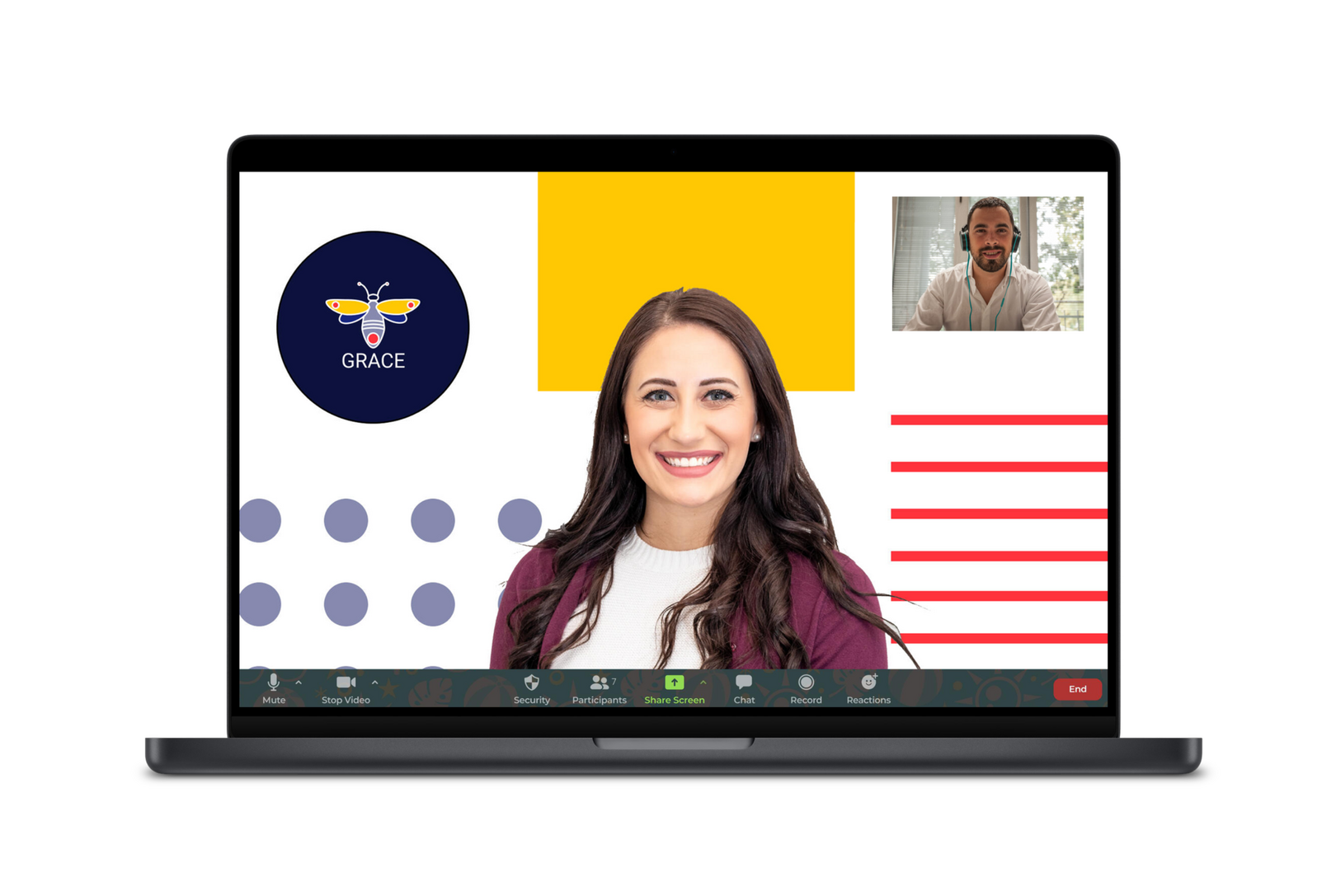
Designed initial versions of the master logo and team logos.Developed sample Google Slide templates incorporating the new brand identity.Created draft Google Meet backgrounds with engaging visuals and professional layouts.Tested the designs for scalability across different platforms and sizes (e.g. digital vs print).Incorporated feedback loops with employees and leadership.
Inspiration
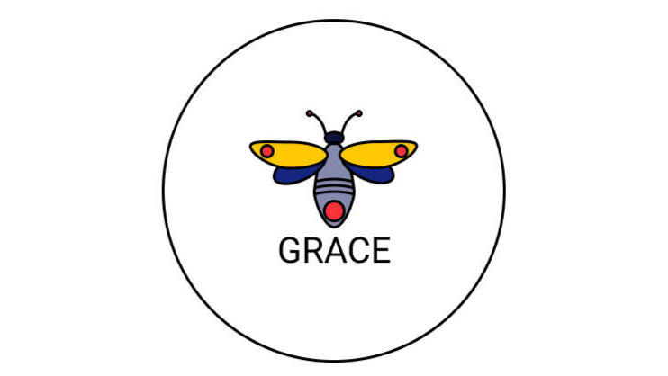
Club Grace got it's name from Grace Hopper, the computing pioneer who discovered a moth in her computer, hence computer 'bugs'. With this in mind, I created the master branding to include a moth, and as the employee teams were all named after other winged insects, this worked perfectly!

Presented prototypes to employees and leadership for feedback on visuals, tone, and usability.Gathered feedback from a small group of clients on the new brand identity.Conducted A/B testing on slide templates and backgrounds during internal presentations.Iterated designs to address feedback and ensure alignment with objectives.

Launched the new master and team logos with a celebratory event to boost morale.Provided employees with branded assets, including templates and video call backgrounds.Shared branding guidelines to ensure consistent application moving forward.Monitored the impact through employee and client feedback post-launch.
UX RESEARCH CASE STUDY
HEINEKEN STAR PUBS & BARS | Consumer Loyalty
A pub chain wanted current post-pandemic consumer data and how that would inform actions around loyalty products.
MY RESPONSIBILITIES
User Research
User Interviews
Personas
Wireframe / Prototype
User Testing
Design Solution
DELIVERABLES
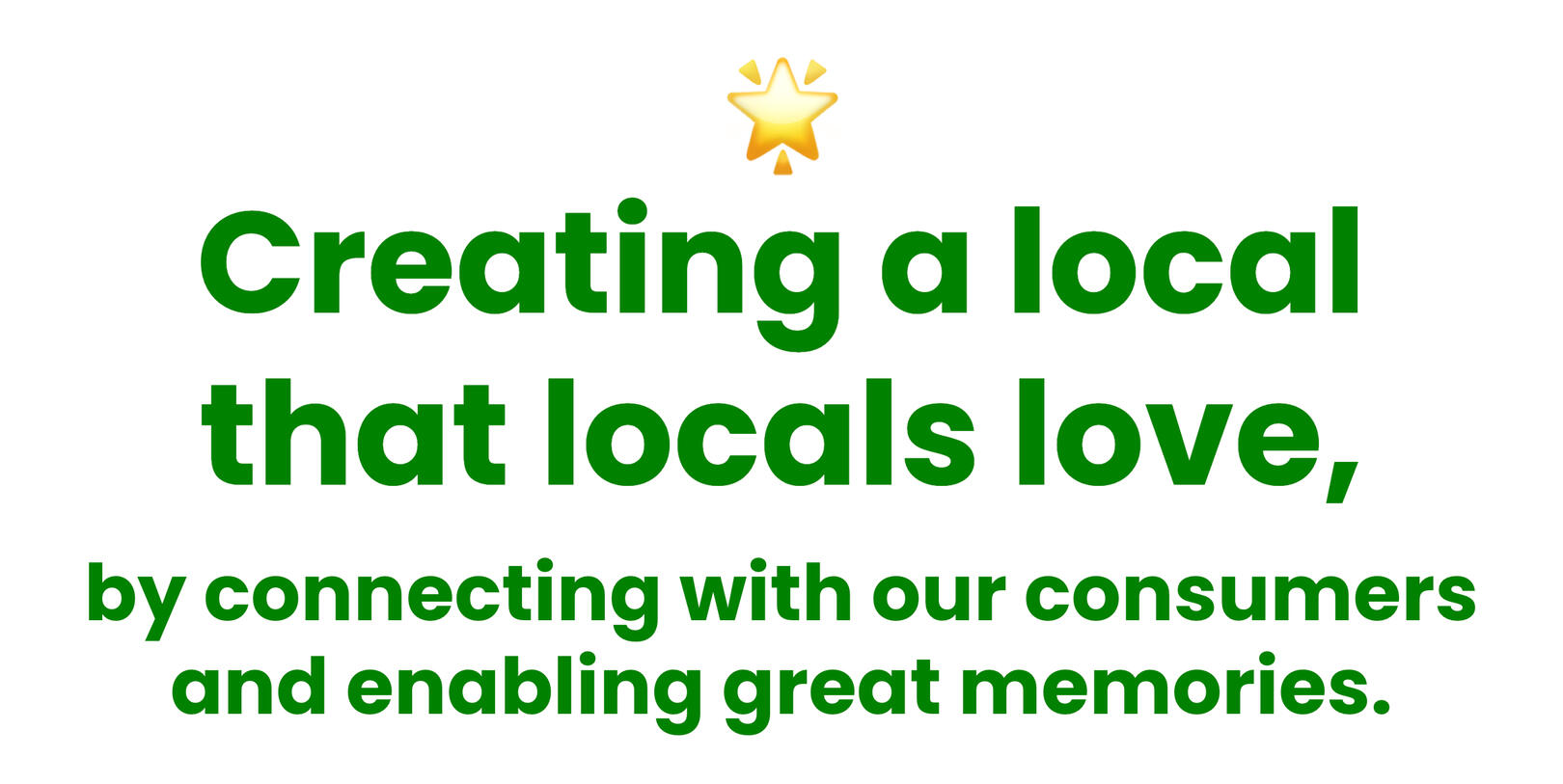
North Star Vision
Personas & User Journey Maps
User data derived from interviews
User-tested wireframes
Product Recommendations
IMPORTANT ASPECTS
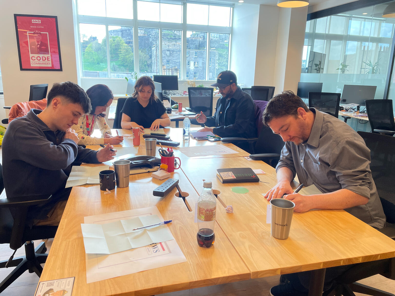
5 person team
1 month long project
THE PROBLEM
A pub chain wanted current post-pandemic consumer data and how that would inform actions around loyalty products.
THE PROCESS
Design thinking allowed me to empathise with the consumer via ethnographic research and interviews and user testing sessions allowed for feedback on wireframes and prototypes of proposed loyalty products.
THE BUSINESS OUTCOMES
The research gave the organisation extensive consumer insight into pub-going behaviours and challenges as well as their consumers' thoughts on loyalty products, resulting in a recommended product design direction which is now in development.
WHEN GATHERING INSIGHTS, I PUT ASIDE MY OWN OPINIONS AND PAY ATTENTION TO WHAT I HEAR AND SEE. HERE ARE MY SOURCES:
PRE-EXISTING DATA
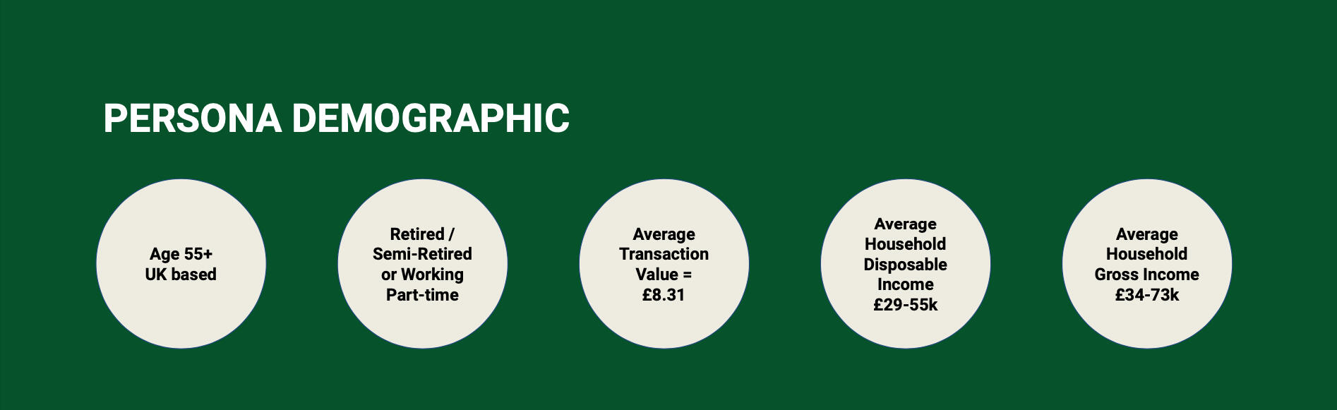
Collated all pre-existing data for the demographic 50+ and the 'local' pubs in the pub chain.
PUB GOERS
Observe pub goers in the pubs to recognise habits and patterns. Engage them in conversation and ask questions about their experiences. Conduct remote interviews to discover their thoughts and attitudes regarding why, when and where they go to the pub, what encourages or prevents their brand loyalty and thoughts on using digital loyalty products. Discover their pain points and opportunities throughout their customer journey.
PUBLICANS & BAR STAFF
Observe publicans and bar staff to gauge how they interact with the pub-goers. Ask them how they currently engage with pub-goers, and how they work towards increasing footfall. What pain points and opportunities are there?
POV - POINT OF VIEW
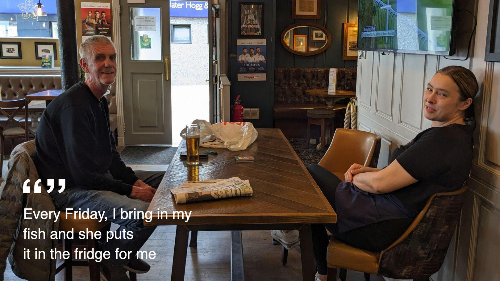
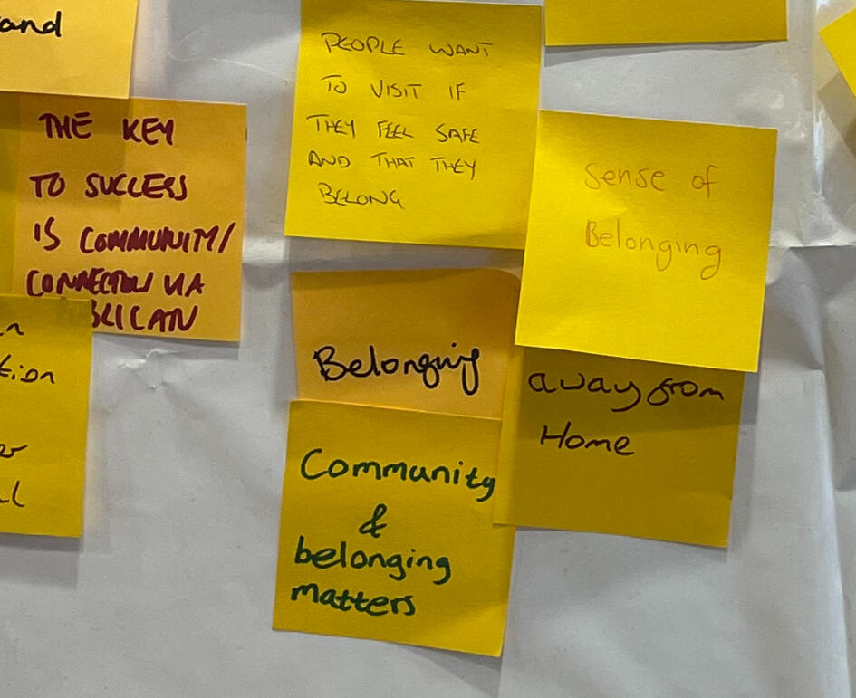
The target demographic of age 50+ are finding it difficult to justify spending money in the pub, especially during a cost of living crisis.
USER SCENARIO
John has little money left over from his pension at the end of the week. He lives alone, so going to the pub is a chance to chat to people including the barmaid. It is part of his weekly routine.
TOP COMMON PAIN POINTS CONSUMERS FACE WHEN GOING TO THE PUB
Lack of money
Pub is too noisy
Bad prior experiences in pub
Only go for special occasions
Nobody to go with
COMPETITOR ANALYSIS
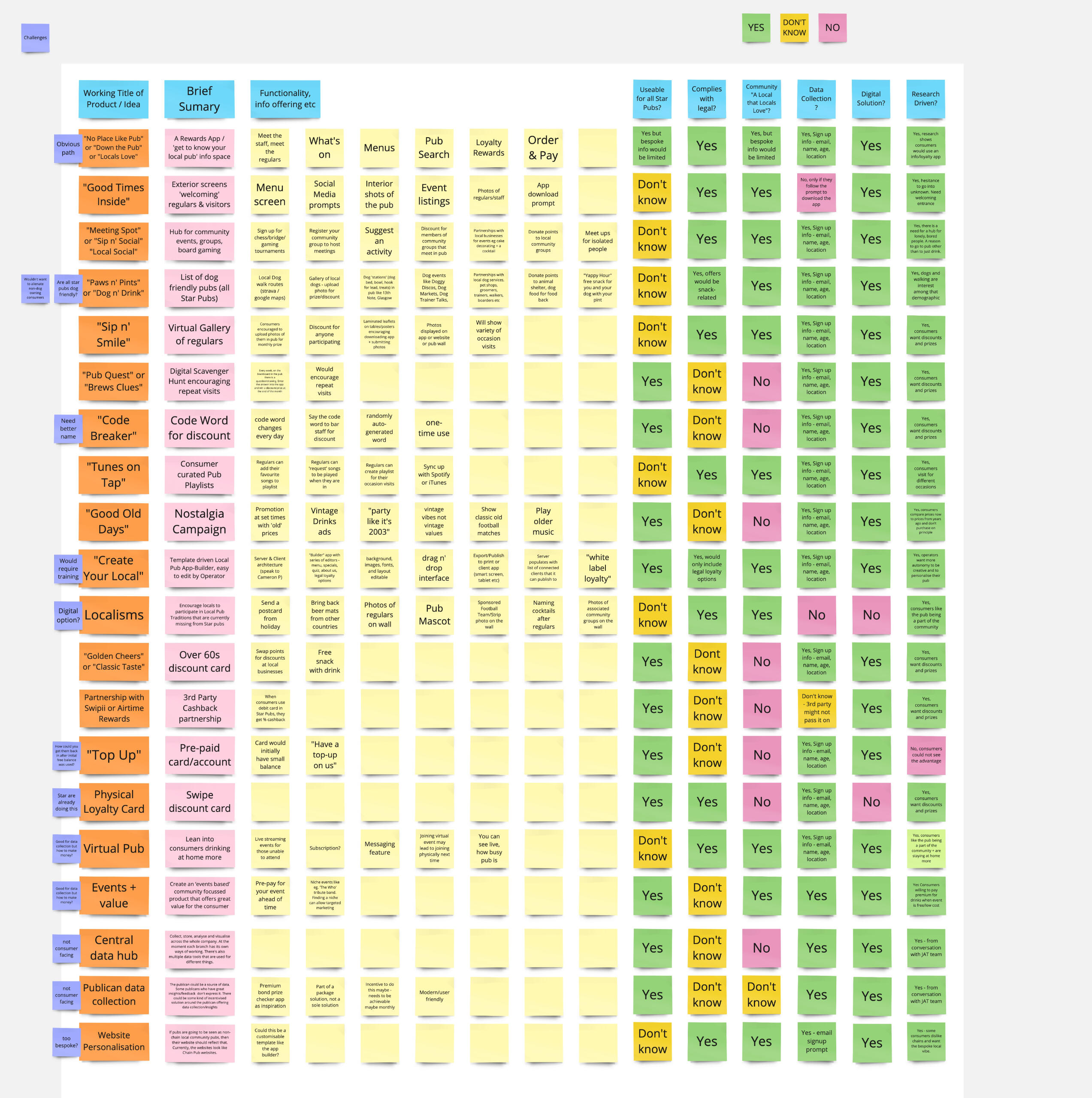
I analysed the top competing pub chains to find out how they tackled consumer loyalty.
| Greene King | Vintage Inns | Punch Pubs | Trust Inns |
|---|---|---|---|
| Neuromancer | William Gibson | 1984 | 0-441-56956-0 |
| Snow Crash | Neal Stephenson | 1992 | 0-553-08853-X |
| Software | Rudy Rucker | 1982 | 0-441-77408-3 |
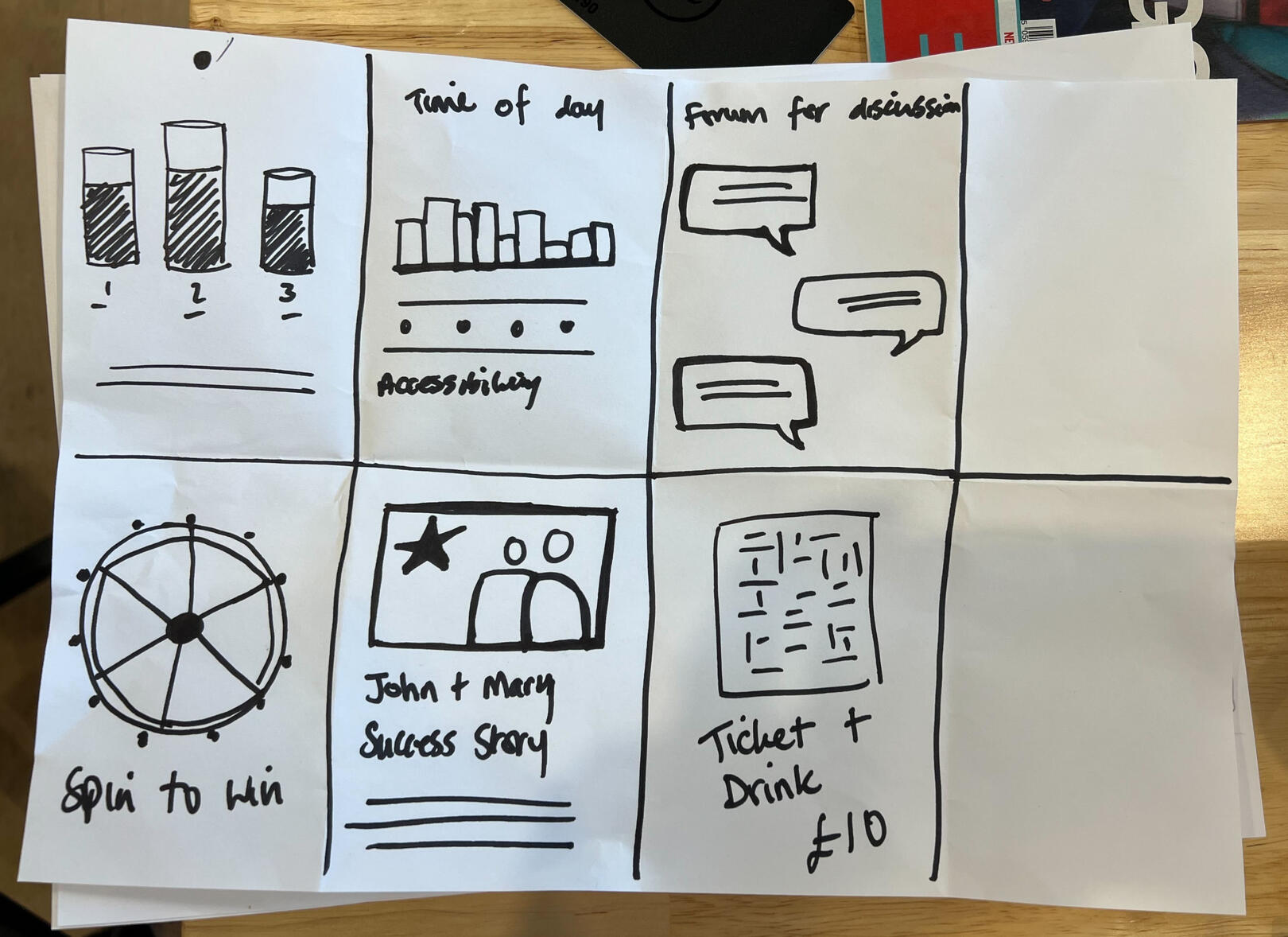
SKETCHING IDEAS
Summary of what the sketch is.
The Brief
Research
- Define aligned future vision for Star Pubs and Bars
- Refine customer and publican experiences
- Create value exchange for customers
- Validate consumer and publican value propositions
- Target high-value audience segments
- Develop execution plan, budget, and ROI justification
- Determine required operating models and resources
- Transfer data insights and design thinking knowledge
- Build an up-skilled research team and infrastructureProduct Design
- Ideate loyalty products
- Develop low-fidelity wireframes
- Roadmap proposed future development
Pain Points | Differing legalities surrounding the sale of alcohol in Scotland and England. Gambling laws. Desired one-size-fits-all solution. Publican reticence to digitalisation. Loyalty app fatigue.Learnings | Footfall hindered by physical, localised issues eg. lighting, noise that a digital product may not solve.Success | Continued development of the loyalty app tailored to the unique needs of pub-goers while aligning with Heineken’s brand values.Future Development | High-fidelity designs with more user testing and iteration based on feedback. Run a pilot programme by implementing small-scale trials of loyalty initiatives in select pubs to test real-world applicability.
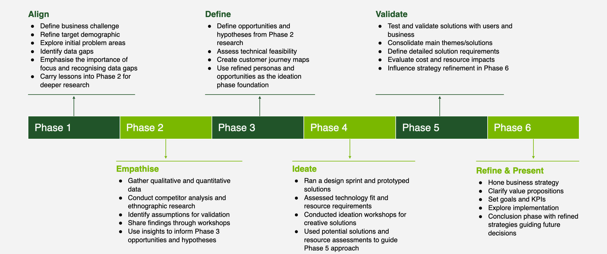
The Design Thinking Process
Stakeholder Interviews
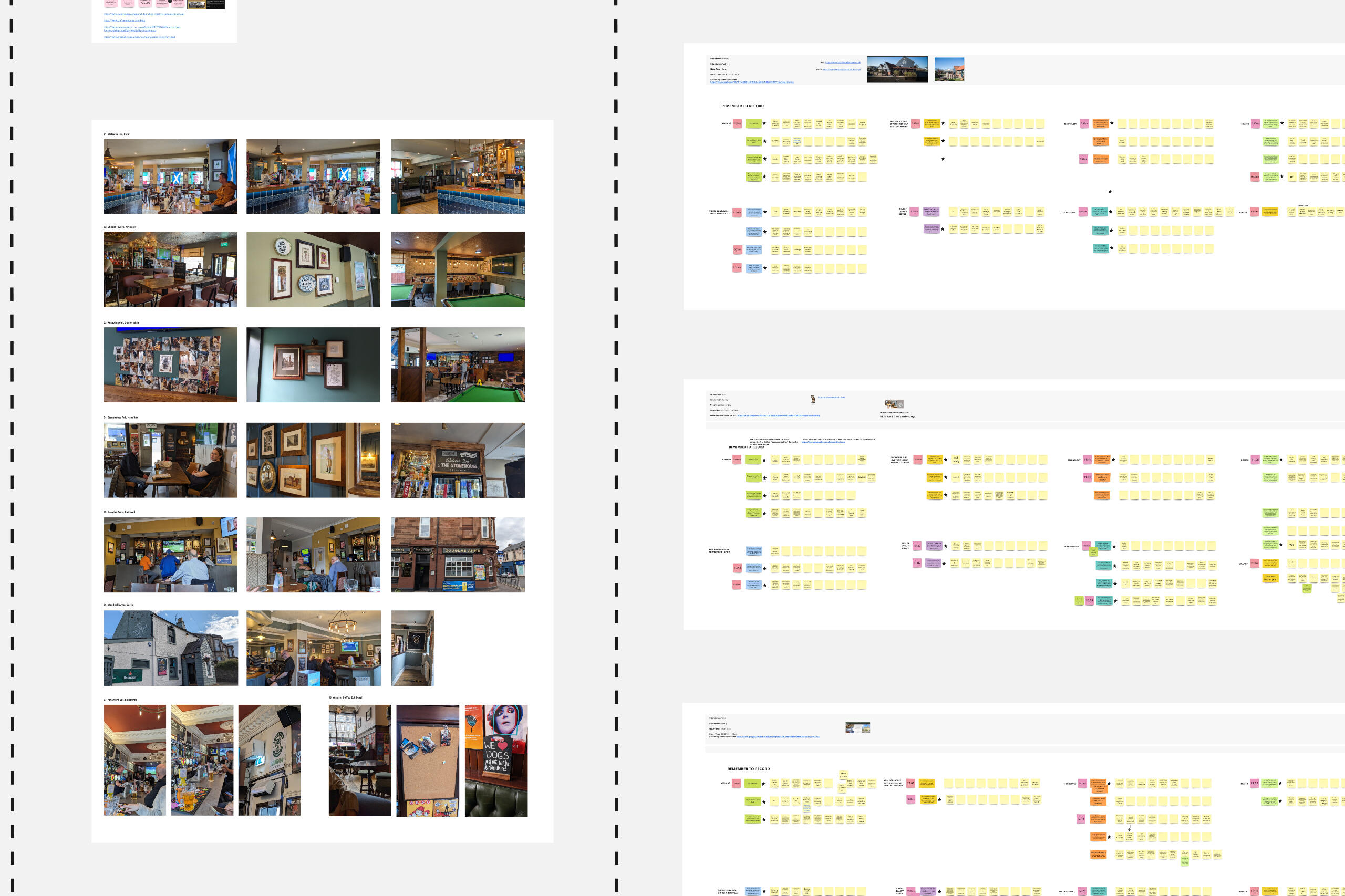
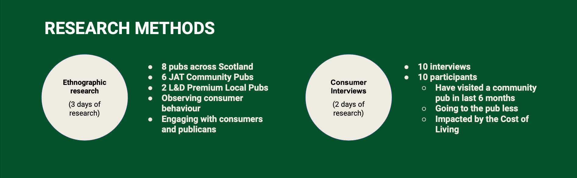
I conducted in-depth interviews with Heineken stakeholders to understand business objectives, current challenges, and loyalty goals.Ethnographic Research
I visited Star Pubs & Bars locations to observe customer interactions and staff-customer dynamics firsthand.Consumer Interviews
Interviewed the target demographic to gather quantitative data on consumer preferences, behaviours, and motivations.Data Analysis
Reviewed existing consumer interaction data (e.g. previous loyalty program usage, sales data, personas and reviews) to identify patterns and trends.Competitor Analysis
Research competitors' loyalty programs to identify industry standards and innovative approaches.
Ethnographic Research & Consumer Interviews

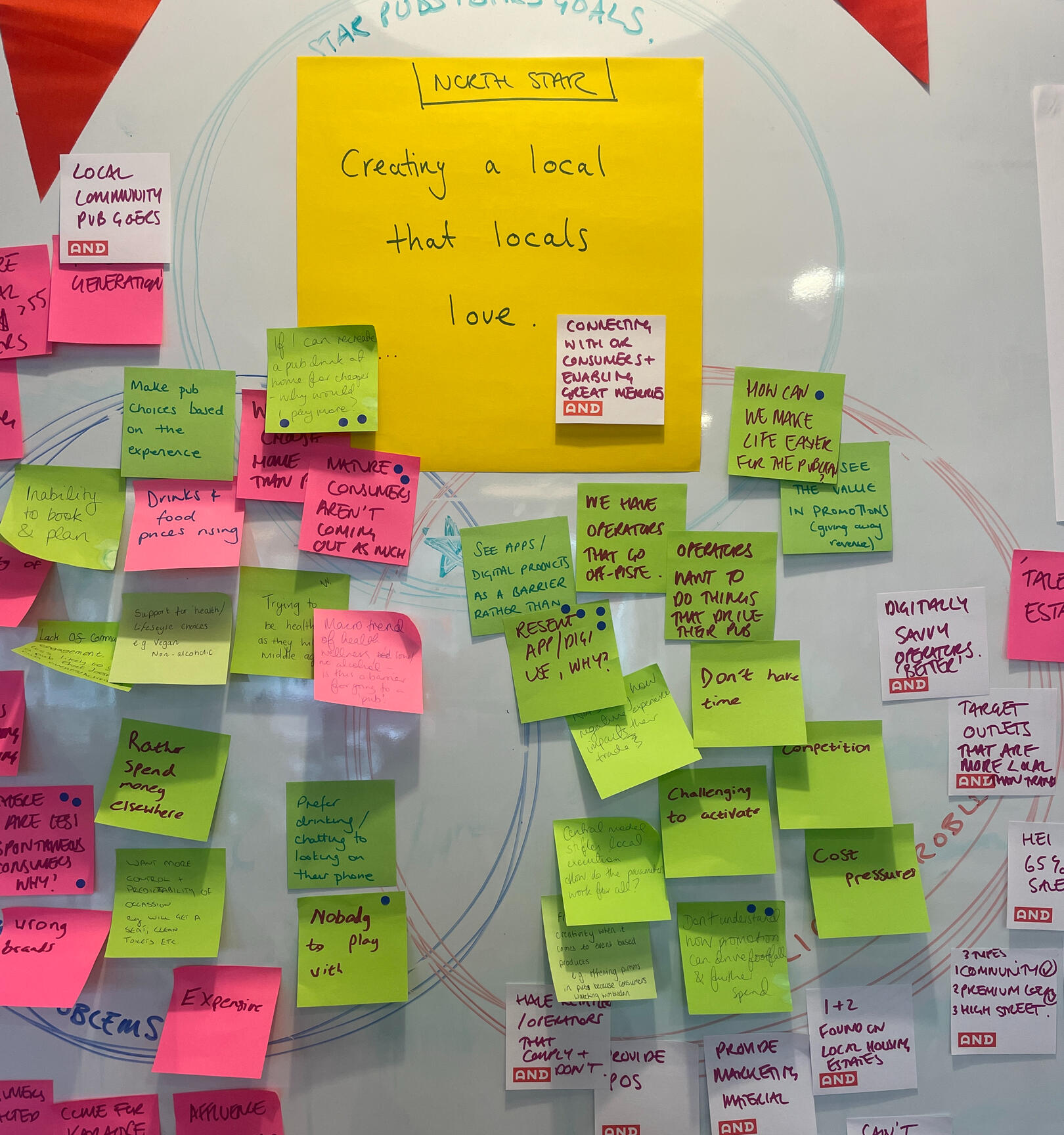
Align Vision
I co-led a North Star Vision session, empowering stakeholders to actively shape the project’s direction. This collaborative approach allowed the client to feel ownership of the project's vision and direction.Insight Analysis
Consolidated findings from pub visits, interviews, and data analysis to identify loyalty drivers and barriers.Customer Segmentation
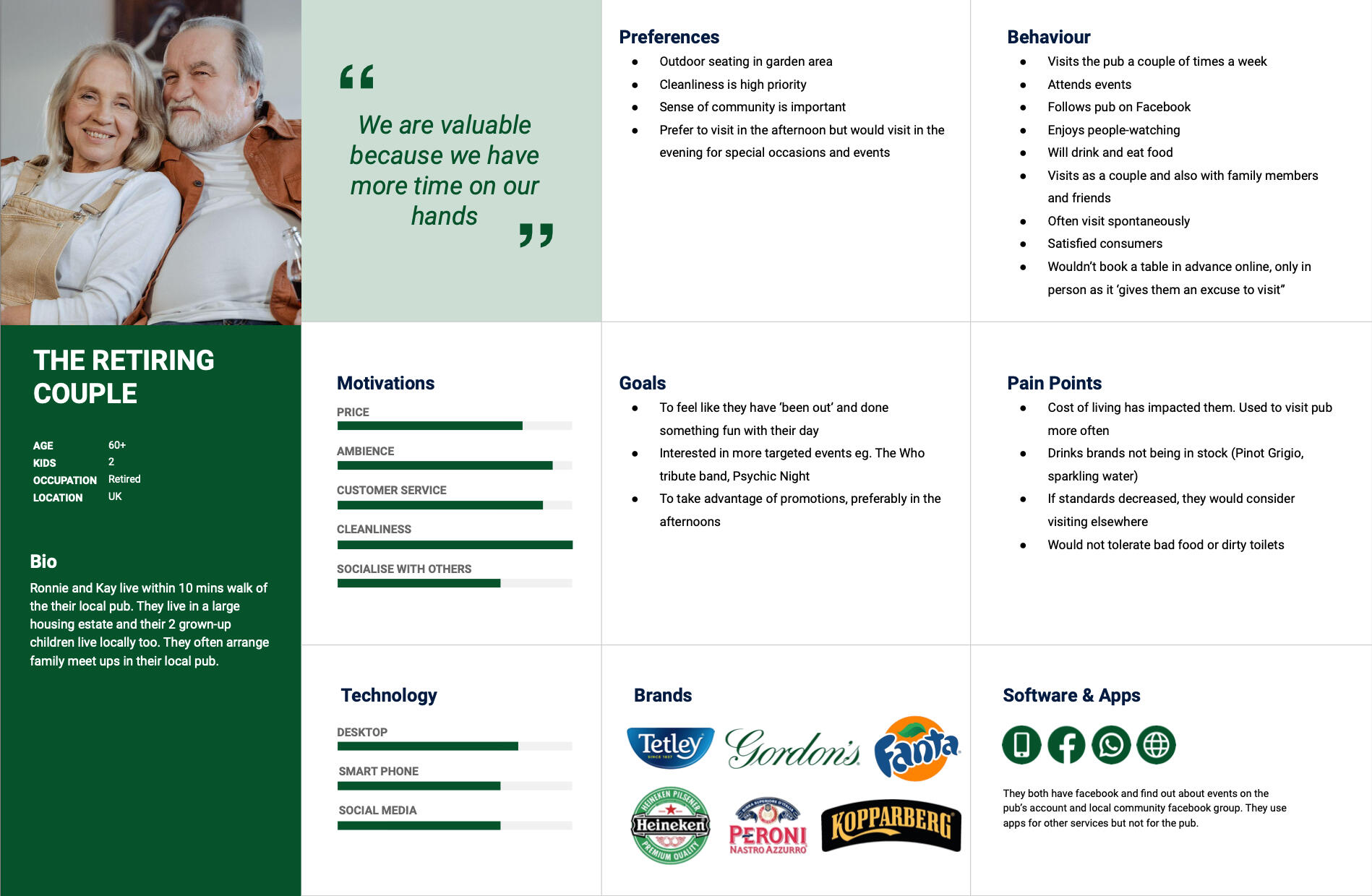
Defined key consumer segments based on behaviours, preferences, and demographics.Persona Development
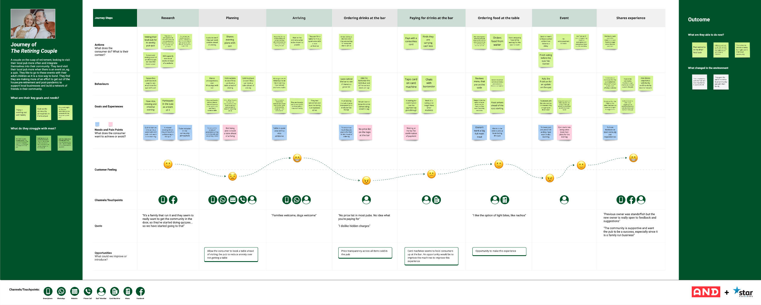
I created detailed user personas that represented the primary customer types, emphasising their motivations and pain points.Journey Mapping
Developed customer journey maps that illustrated key touch-points, challenges, and moments of opportunity in the pub experience.Problem Statement
“How might we create a loyalty experience that feels personalised and rewarding to diverse pub-goers?”

Brainstorming Sessions
Conducted workshops with cross-functional teams to ideate loyalty programme concepts, digital tools, and engagement strategies.Co-Designed with Consumers
Invited select pub-goers to collaborate in ideation sessions, ensuring solutions resonated with real customer needs.Idea Prioritisation
Used criteria like feasibility, alignment with brand identity, and potential impact to shortlist top ideas.Conceptualisation
Drafted initial concepts for loyalty solutions, such as gamification features, tiered rewards programs, and community-building initiatives.

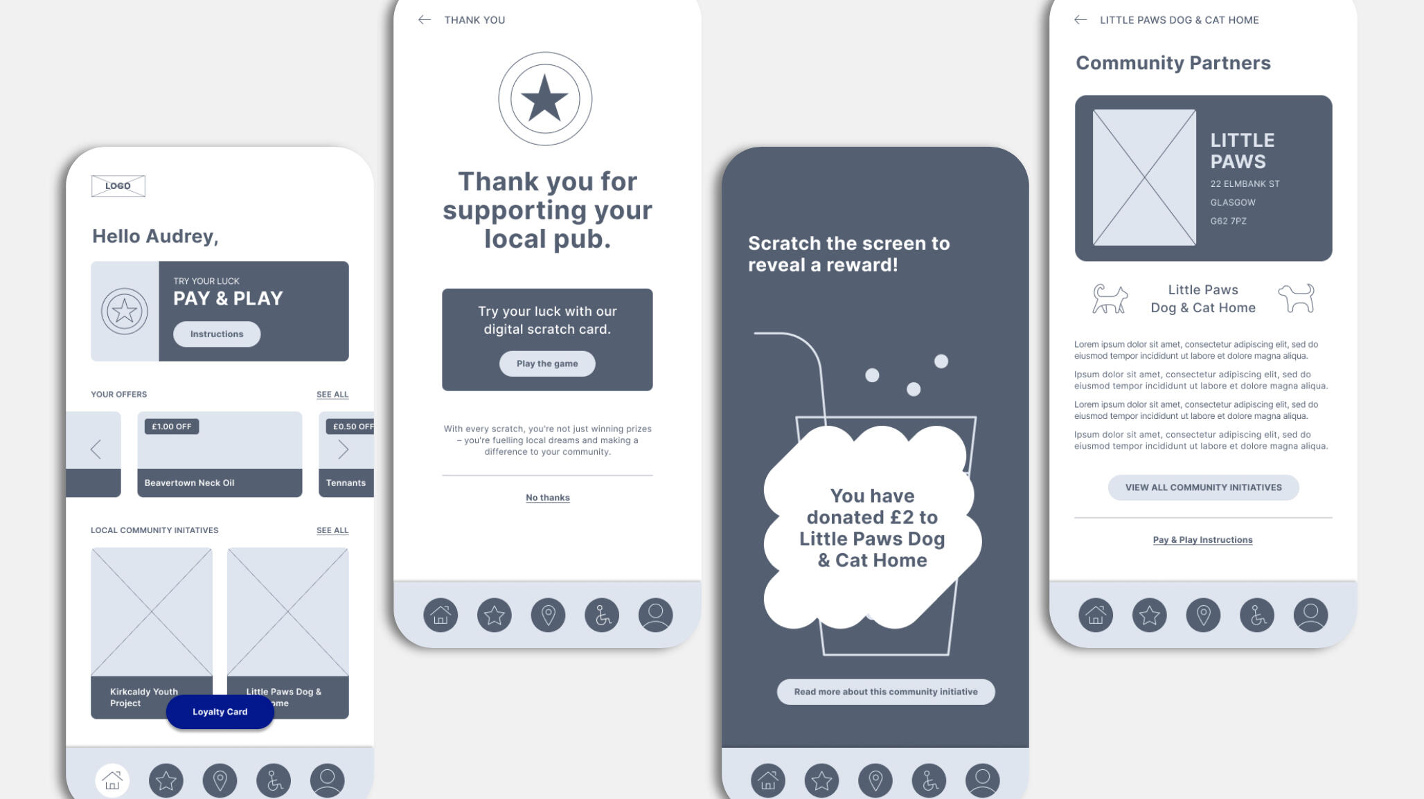
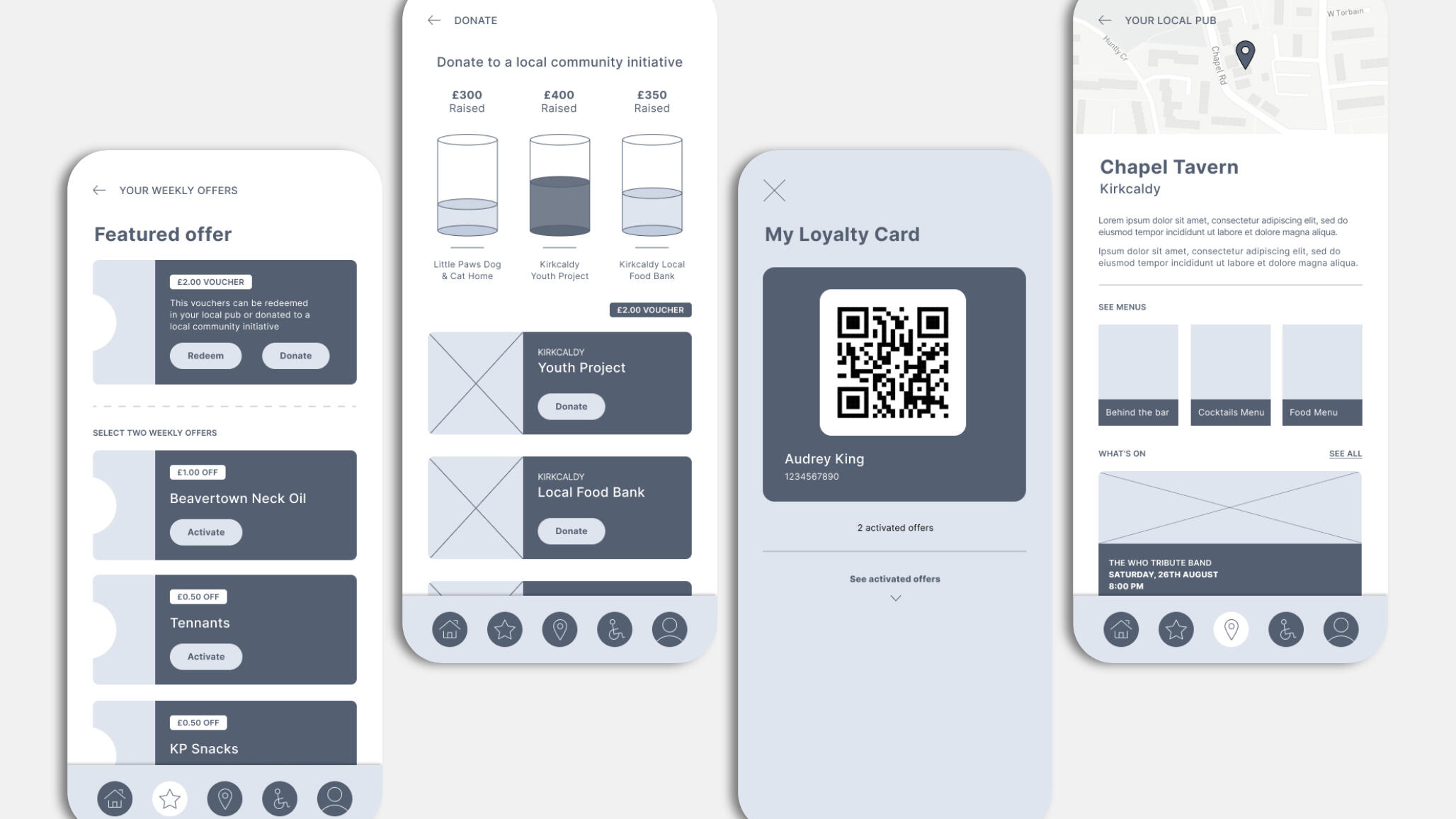
Wireframes and Mockups
I created low-fidelity wireframes and visual mockups for digital loyalty apps.Service Prototypes
Designed physical prototypes for non-digital loyalty initiatives (e.g. exclusive in-pub experiences).Brand Alignment
Ensured prototypes aligned with Star Pubs & Bars’ brand identity, tone, and visual style.
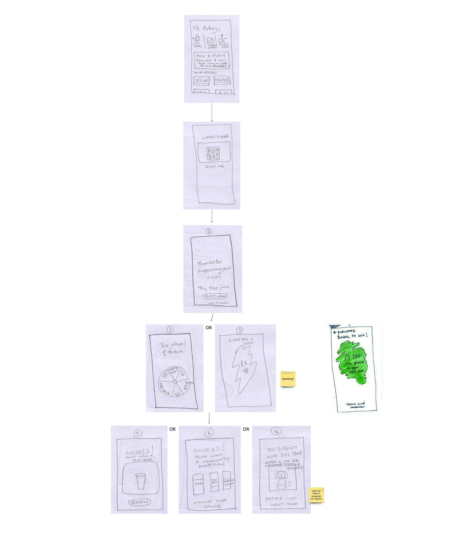
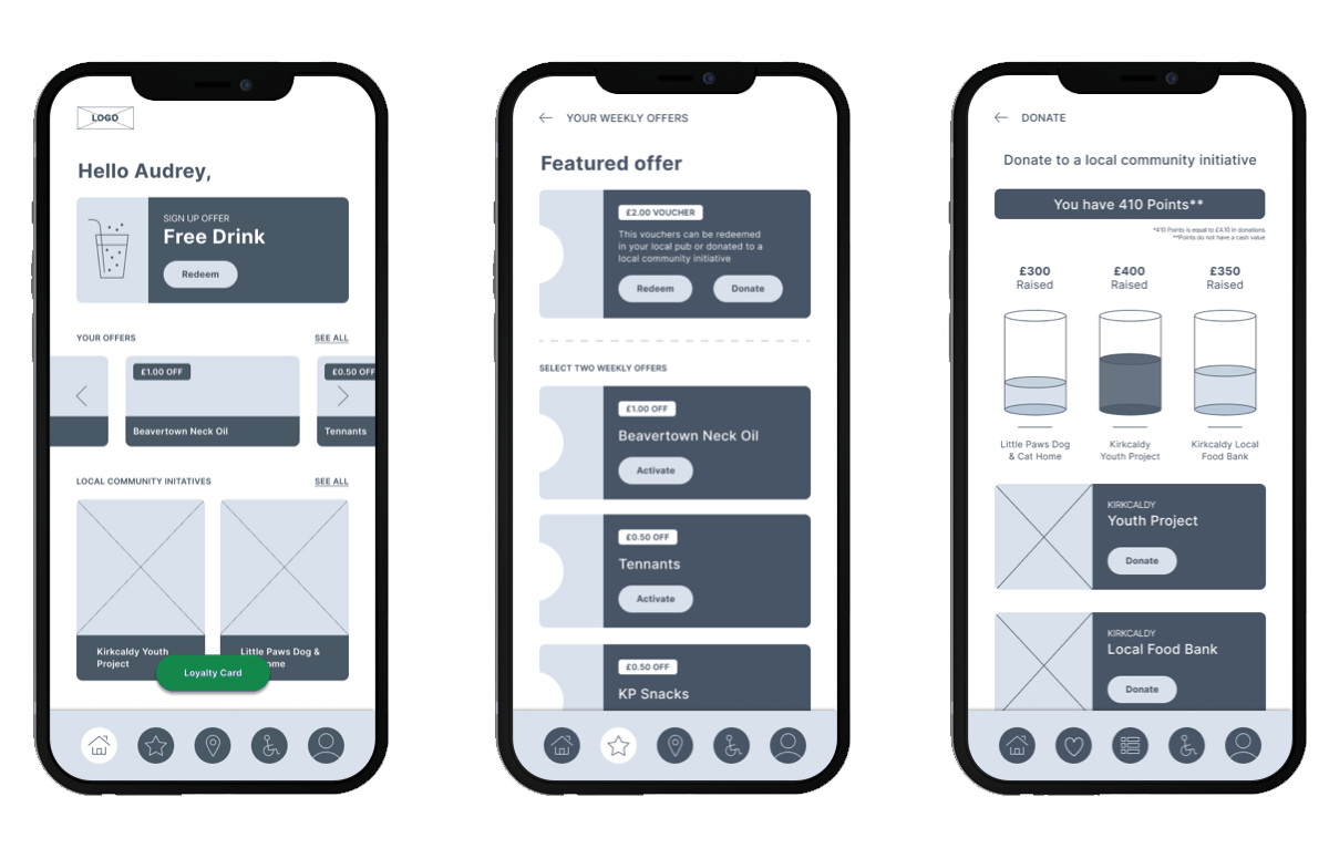
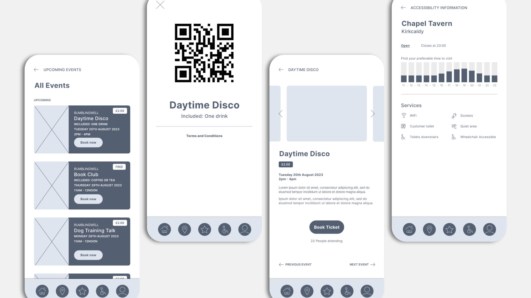
We developed prototypes for 3 loyalty apps:Reward Me
The user could redeem rewards in the form of discounts and gifts redeemable in their chosen pub. Users could also choose to donate rewards to community projects.Reward Community
The user could donate their rewards to their community in the form of a monetary donation. This was an exciting option, as this was a fresh take on the existing loyalty app model that we hadn't seen during our competitor analysis.Events & Value
The user can scroll the events on at their local pub, with a seamless ticket purchasing system.
Reward Me
Reward Community
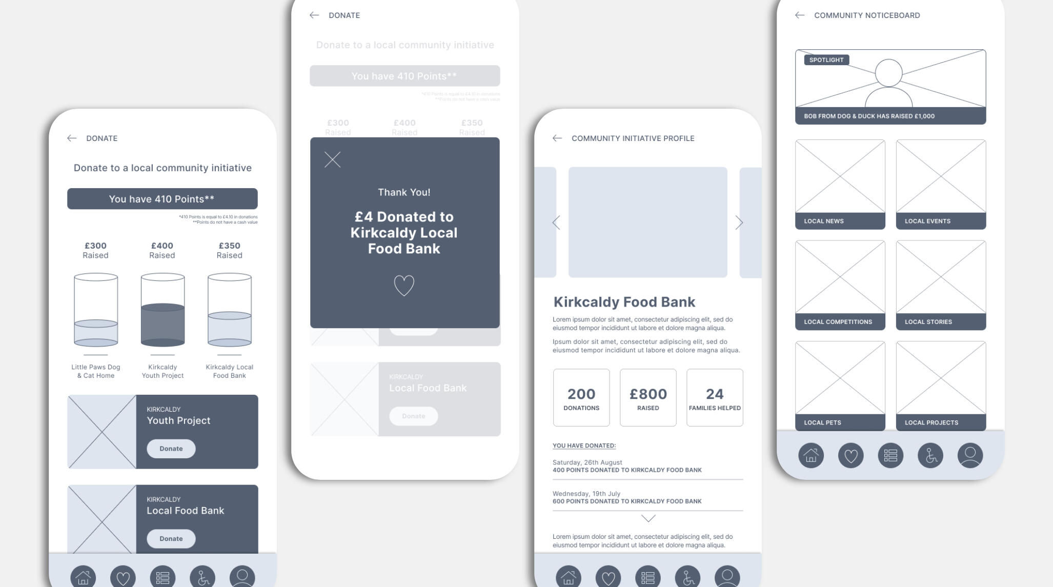
Events & Value

User Testing
I conducted usability testing of all three digital prototypes with pub-goers, gathering feedback on design, functionality, and value.Feedback Loops
Collected qualitative and quantitative feedback from users, pub staff, and stakeholders during testing.I iterated on feedback
Refined prototypes based on testing insights, ensuring solutions effectively addressed customer loyalty challenges.Final Presentation to Stakeholders
Delivered the detailed research report, refined user personas, journey maps, and final wireframes to Heineken, alongside a roadmap for implementation. After user testing the three prototypes, we used these findings to narrow down to our final recommendation which was Reward Me.
BRAND IDENTITY CASE STUDY
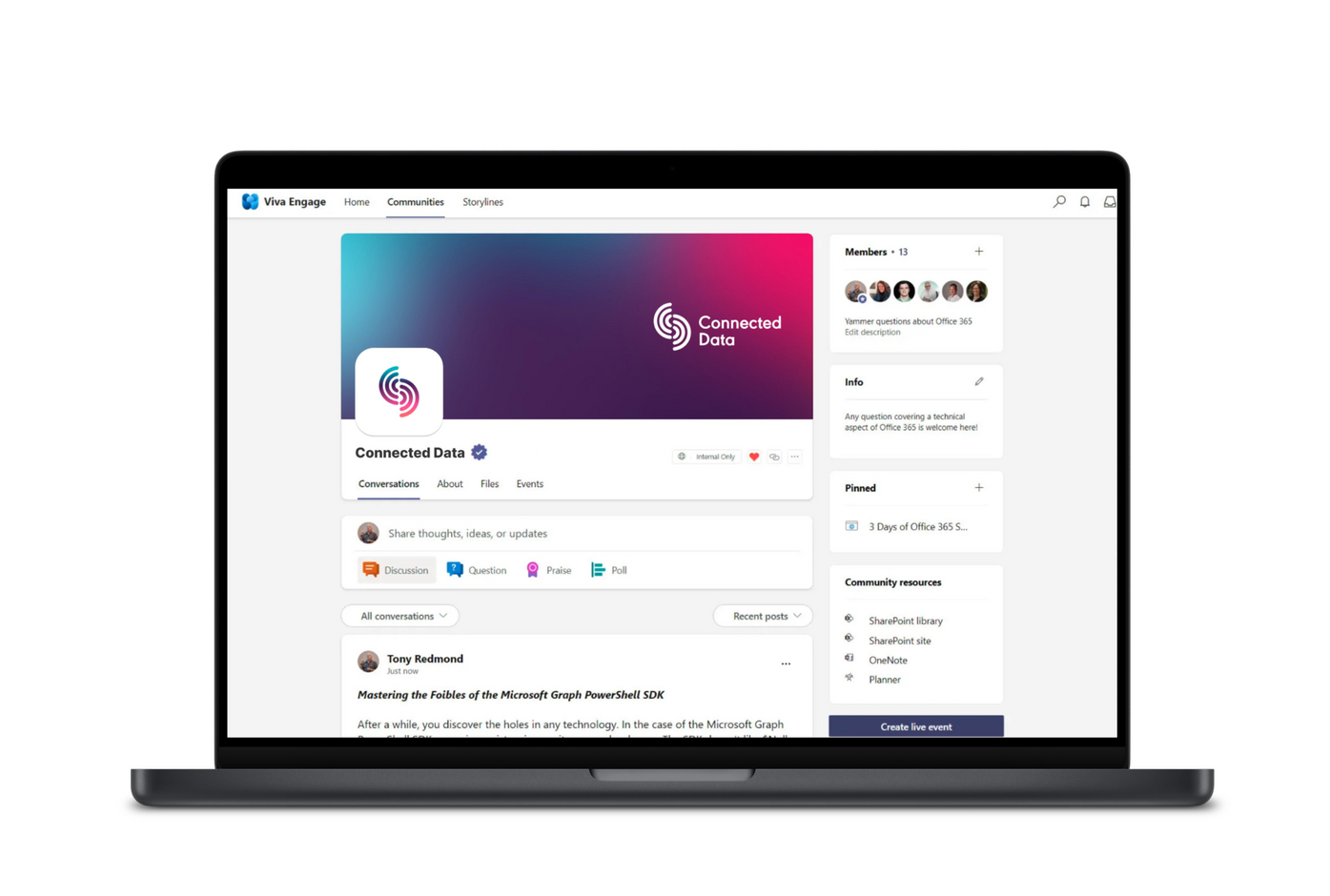
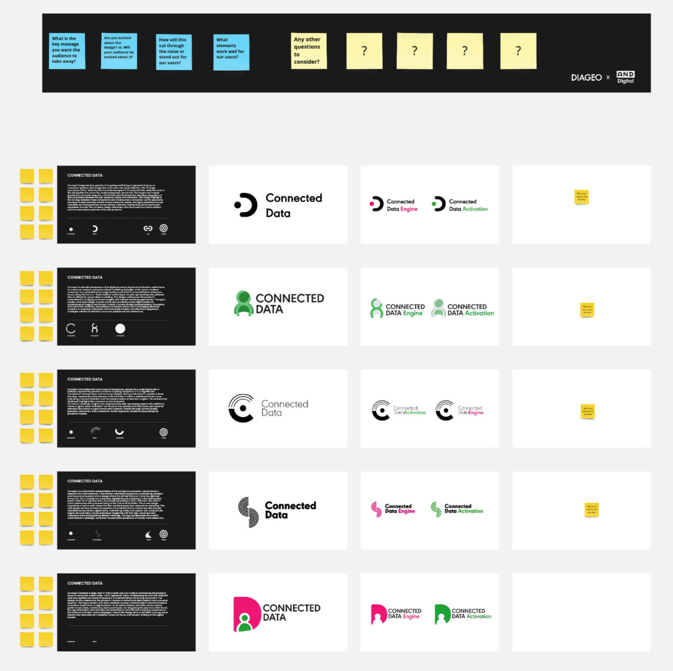
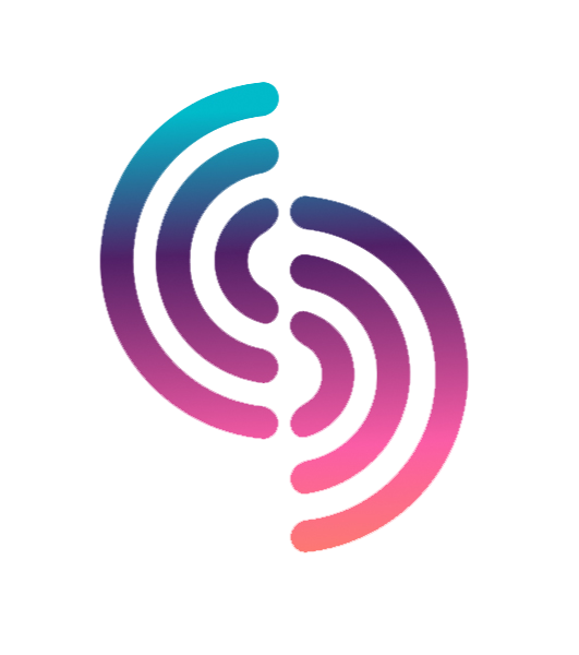
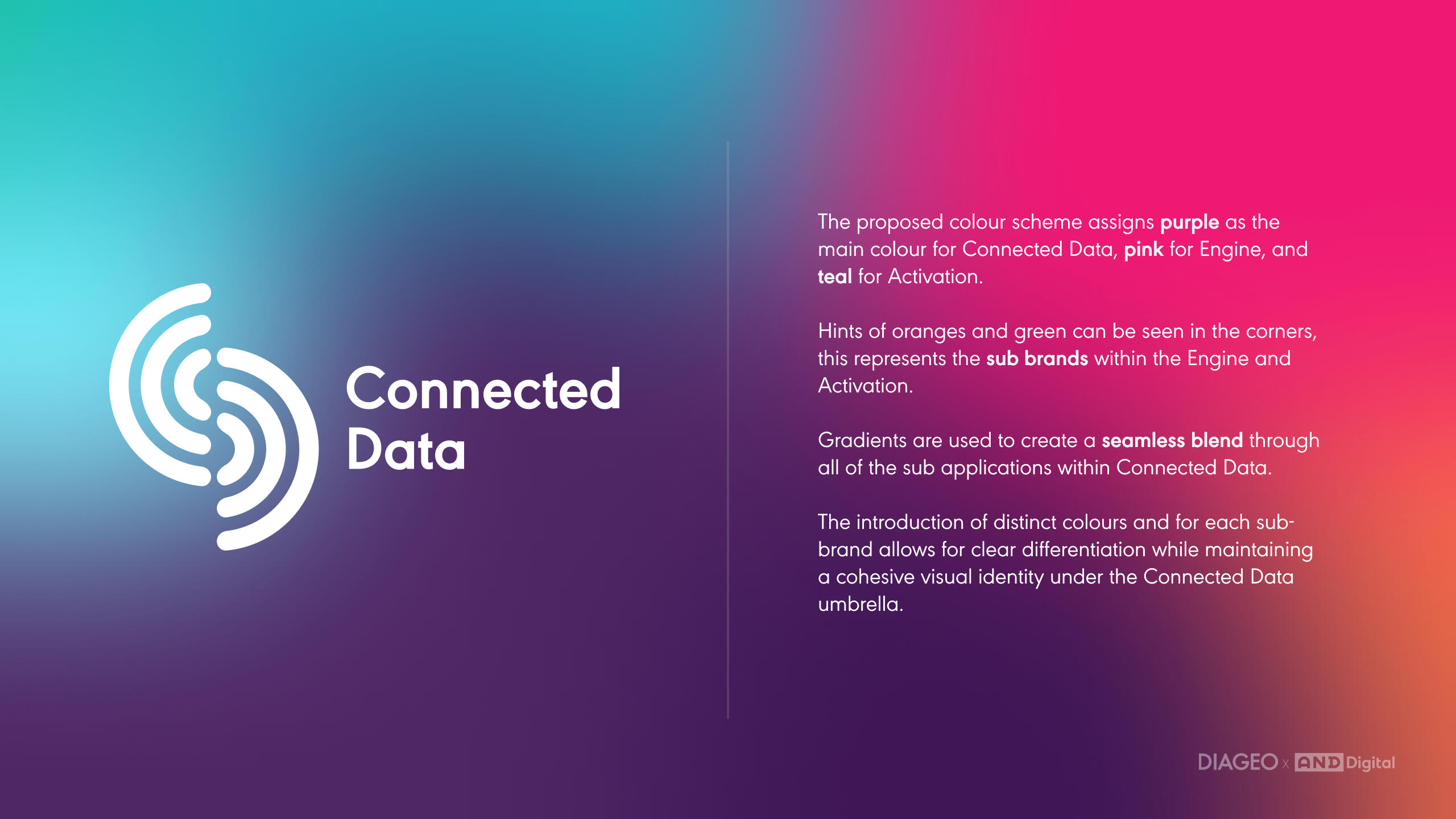
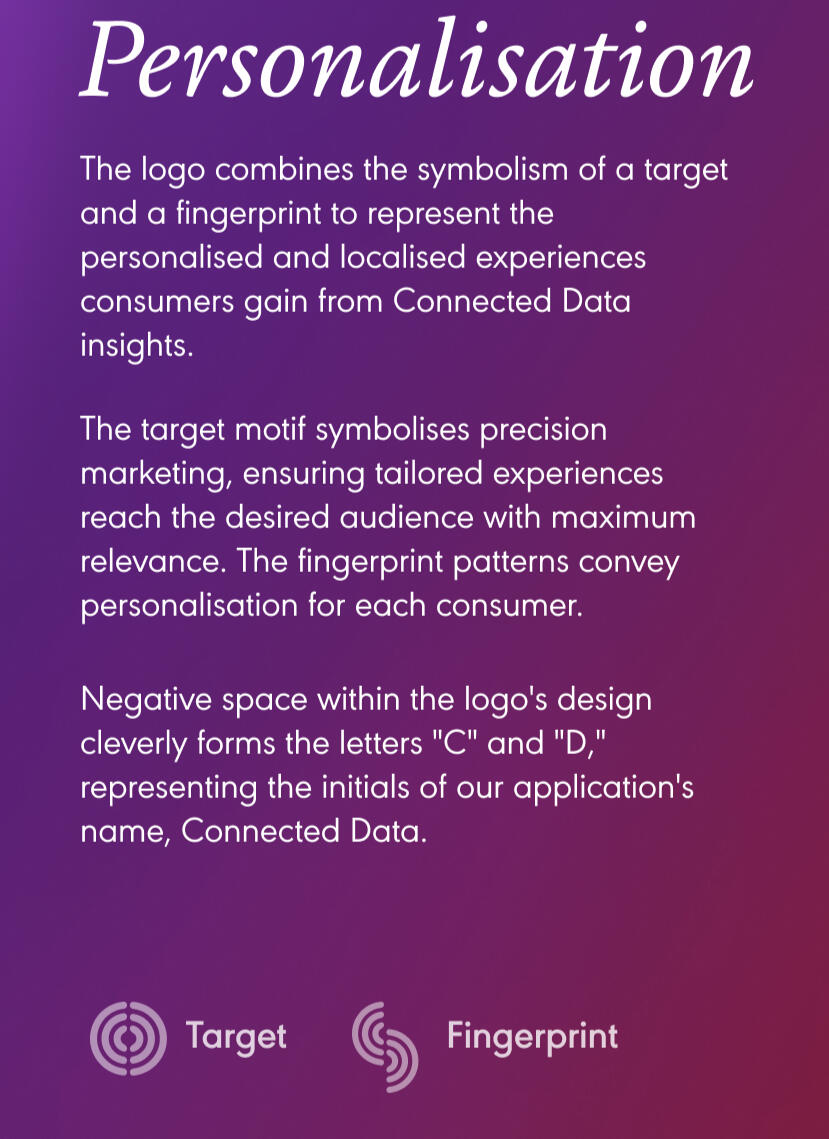
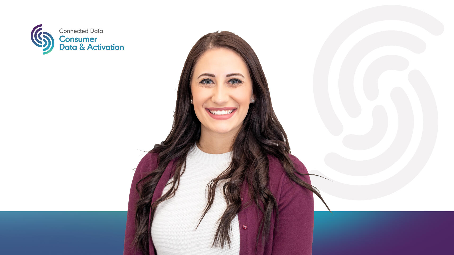
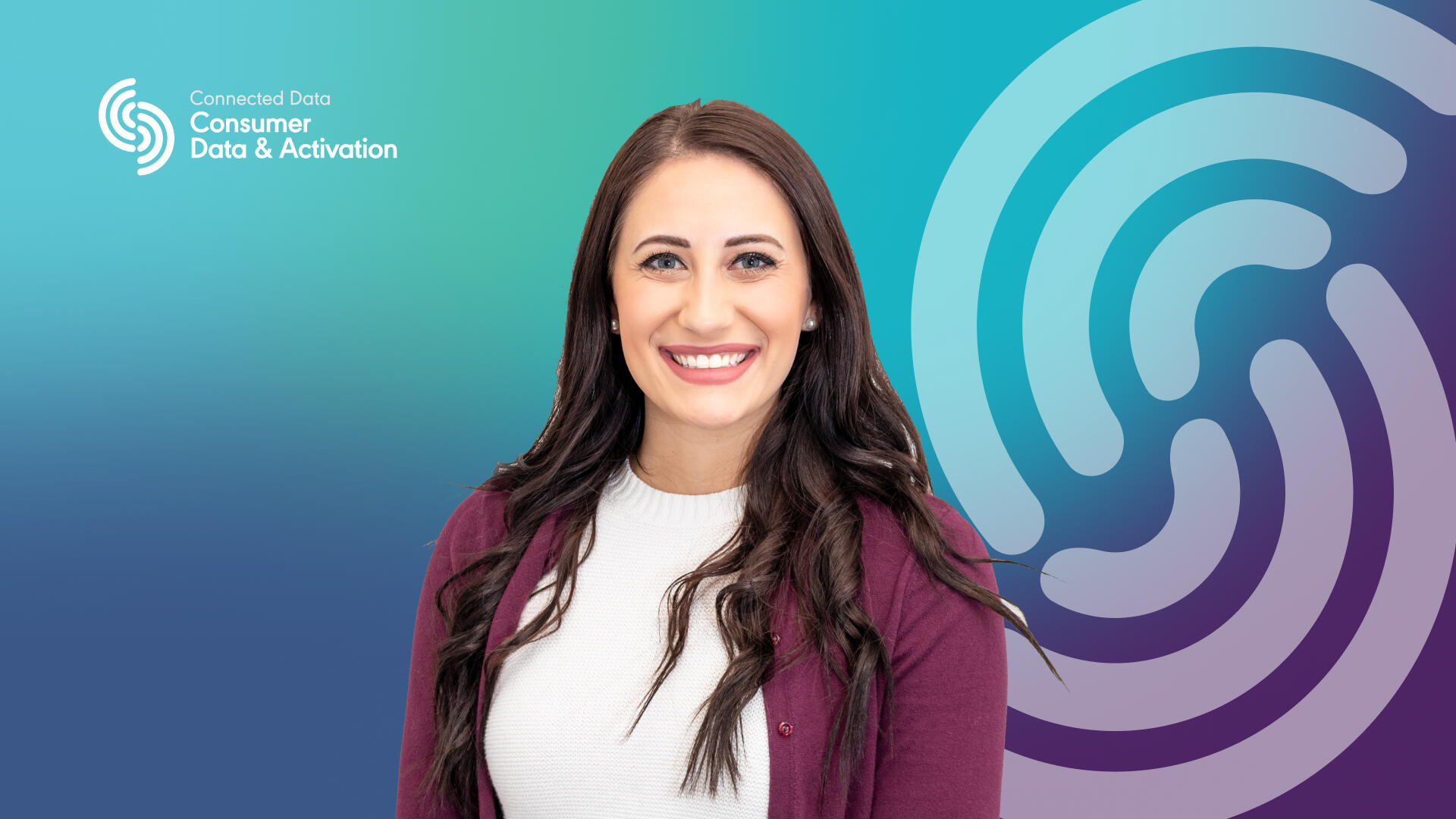
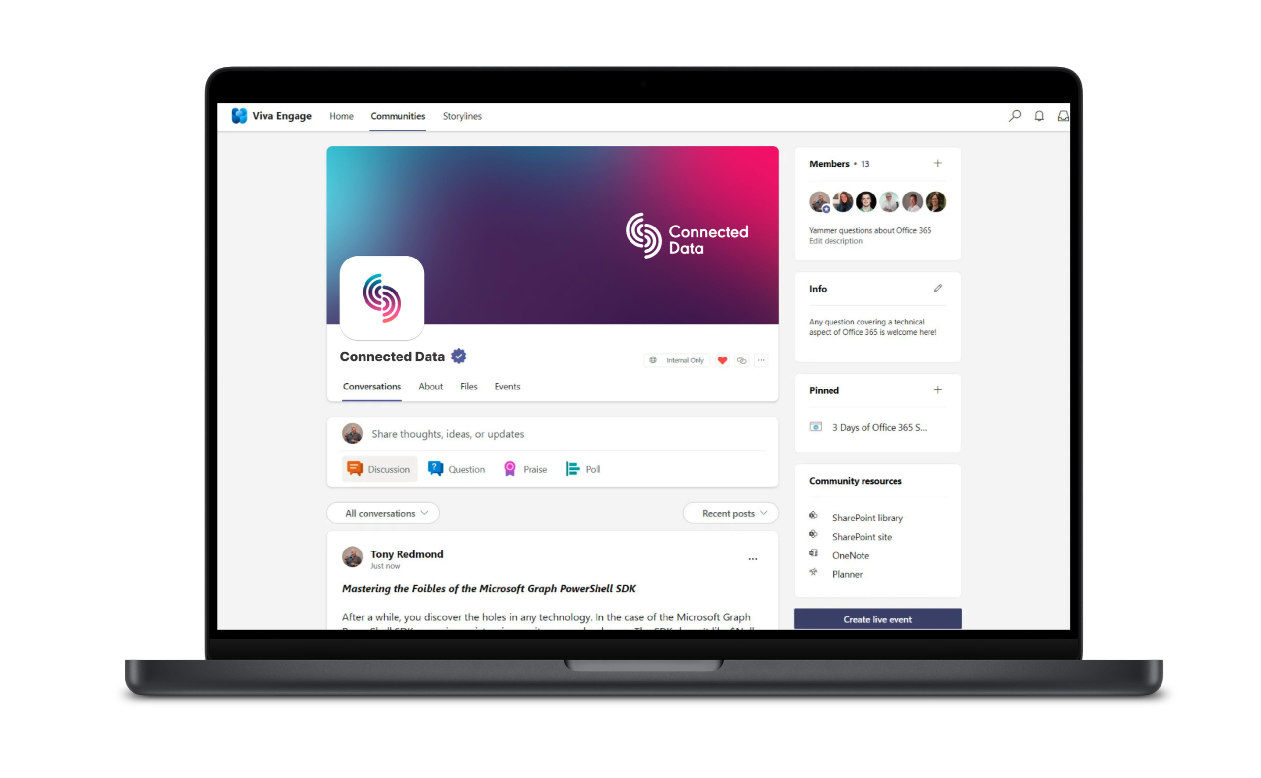
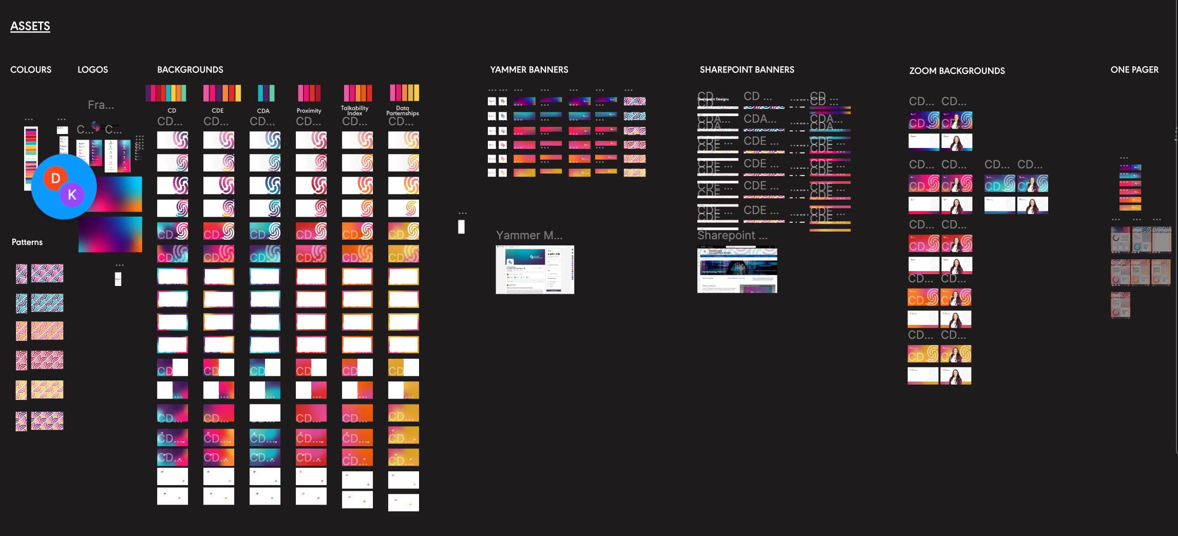
DIAGEO | Connected Data
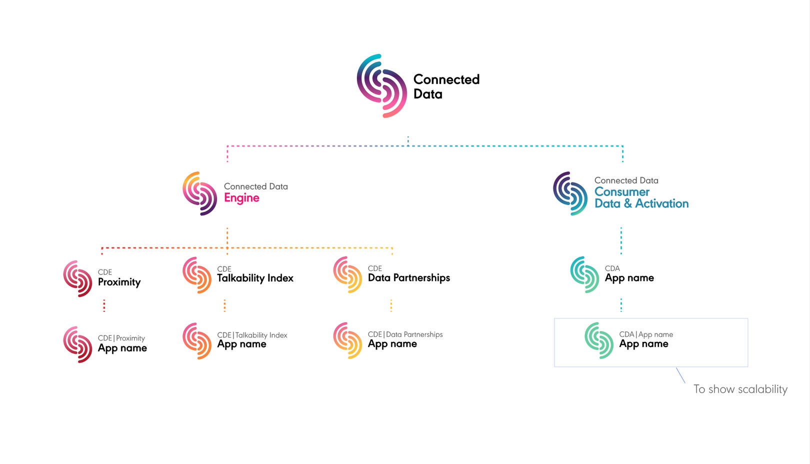
Diageo, needed a brand identity for an internal product ecosystem consisting of a master brand and 5 sub brands.
Role
Visual DesignerProblem
Diageo needed a brand identity for an internal product suite, including a master brand and sub-brands: Data Engine and Data Activation, with room for tertiary levels and future scalability.Process
I co-hosted discovery sessions to understand objectives, followed by concept development for the master brand and sub-brands. Iterative reviews ensured alignment with Diageo’s vision. Testing and refinement ensured usability, consistency, and adaptability for future growth.Business Outcomes
Enhanced internal alignment, boosted user engagement, and improved operational efficiency through a cohesive, scalable brand system. It supports future growth, strengthened Diageo’s innovative reputation, and ensured seamless integration of new tools.
The Brief
Diageo required a cohesive and scalable brand identity for an internal product suite focused on data management and activation. The identity will centre around a master brand Connected Data, with two distinct sub-brands: Data Engine (where the consumer data is collected by various means) and Data Activation (where the data is used to target consumers). The design system must allow for future expansion, incorporating tertiary levels beneath the sub-brands to accommodate additional sub-brands as the suite evolves.MVP
- A master brand identity that reflects Diageo’s innovative and sophisticated ethos while being distinct and aligning with the company’s corporate branding.
- Develop unique but complementary sub-brand identities for Data Engine and Data Activation, ensuring they sit cohesively under the master brand.
- Provide a visual hierarchy that facilitates scalability for future sub-brand and tertiary level introductions.Required Assets (for Master brand and sub-brands)
- Logos
- Powerpoint templates
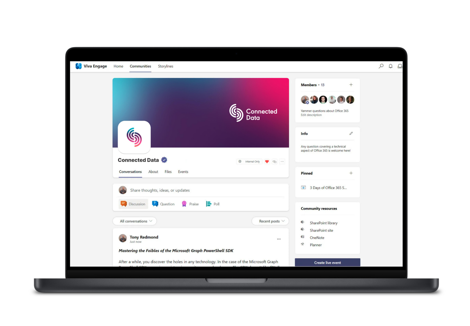
- Viva Engage logos and banners
- Sharepoint logos and banners
- Zoom backgrounds
- One Pager
My Role | Visual DesignerHighlight | My design was chosen to be developedPain Points | Change of scope, misunderstanding by client what one-pager meantLearnings | To use plain language with clients and not designer-speakSuccess | Enhanced Internal Alignment: A unified and scalable brand system fosters a clear understanding of the product suite’s purpose and structure among teams, streamlining communication and collaboration.Improved User Engagement: A cohesive design makes the product suite more intuitive and appealing, increasing user adoption and efficiency in leveraging data tools.Scalability for Growth: The structured branding allows seamless integration of future sub-brands and modules, supporting Diageo’s evolving data strategy without rebranding.Strengthened Brand Equity: Aligning the internal product branding with Diageo’s premium ethos reinforces the company’s commitment to innovation and excellence.Operational Efficiency: A clear, consistent identity reduces confusion, accelerates onboarding, and supports better decision-making through recognisable and user-friendly tools.Future Development | Onboarding & Training Materials: Designing branded, user-friendly materials to onboard employees to the product suite, enhancing usability and adoption.Motion Graphics: This would add value to their communications channels and powerpoint presentations by making them more impactful and memorable.
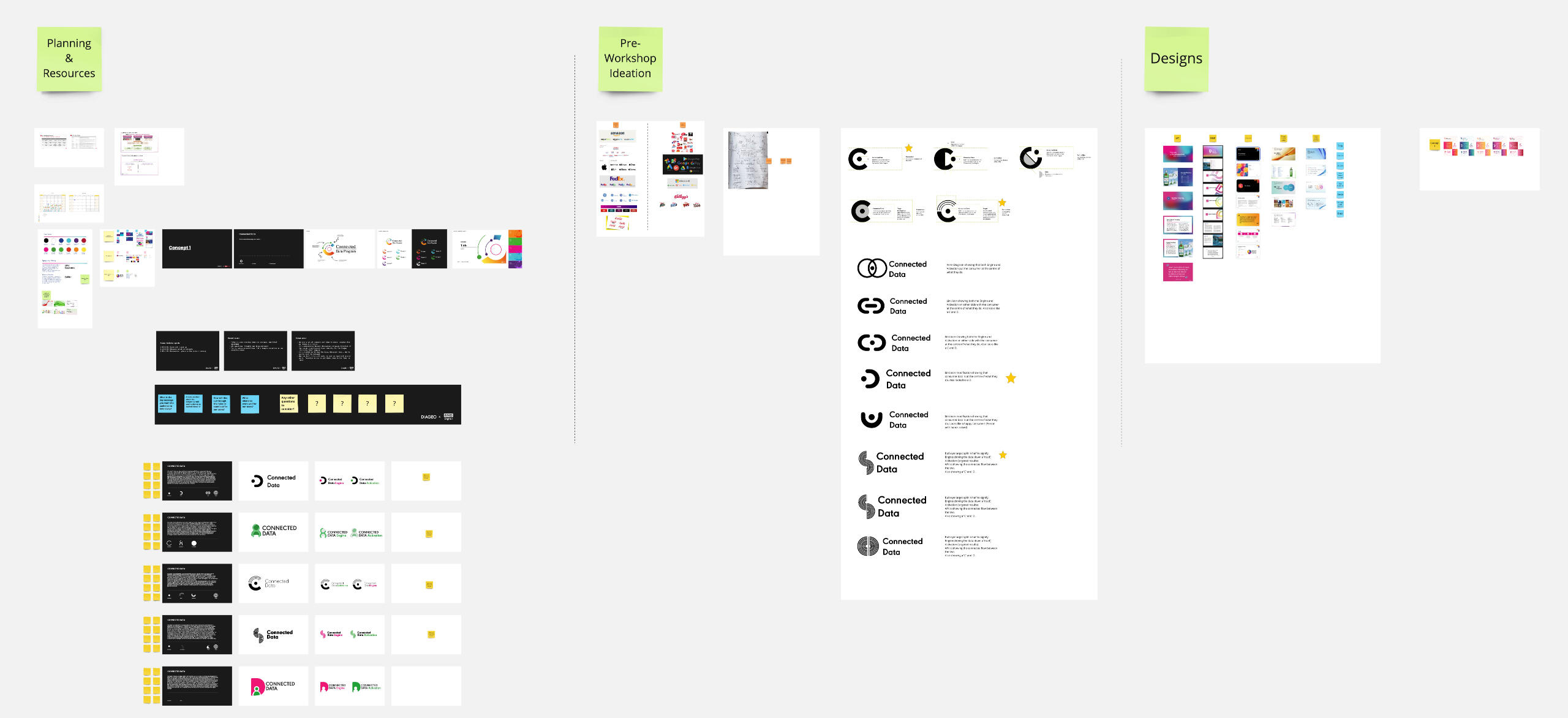
The Design Thinking Process

Conducted stakeholder interviews to clarify business objectives and desired outcomes.Researched Diageo’s corporate brand guidelines to ensure alignment.Benchmarked against similar internal tools or systems from other leading organisations.

Problem Statement
“How might we create a cohesive and scalable brand system for Diageo’s internal data tools?”Outlined the brand’s core principles as innovation, trust, and premium quality.Defined visual hierarchy requirements for the master brand, sub-brands, and tertiary levels.Prioritised design goals as scalability, simplicity, and user alignment.
Aligning with the stakeholder
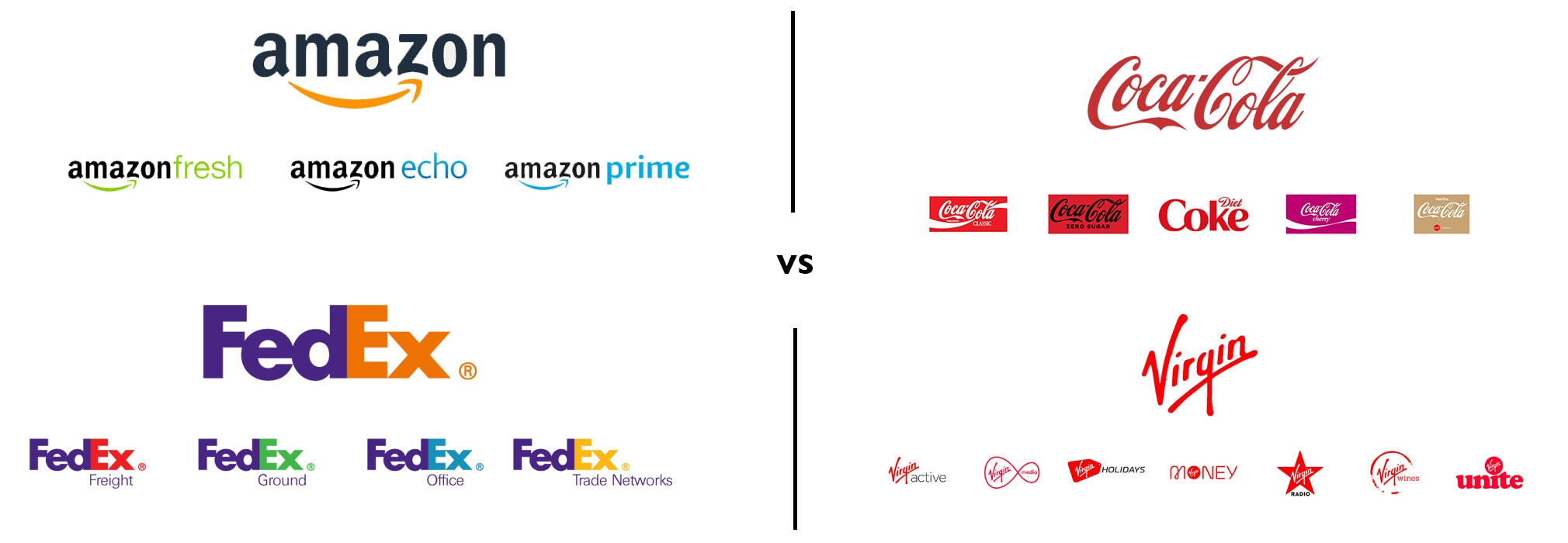
I held an alignment session to ensure that the design team and the client were on the same page. Below are some examples of other Master & Sub branding ecosystems that we showed the client. Due to time restraints, and the need for scalability ease, we recommended following the Amazon and FedEx route where colour was used as a point of distinction between the Master and Sub Brands.

Brainstormed concepts for the master brand and sub-brand visual styles (logos, colour palettes, typography).Explored different ways to structure the brand hierarchy (e.g. colour coding, icon systems).Developed initial sketches and mood boards for the master brand and sub-brands.Reviewed and refined concepts with stakeholders to ensure alignment with expectations.
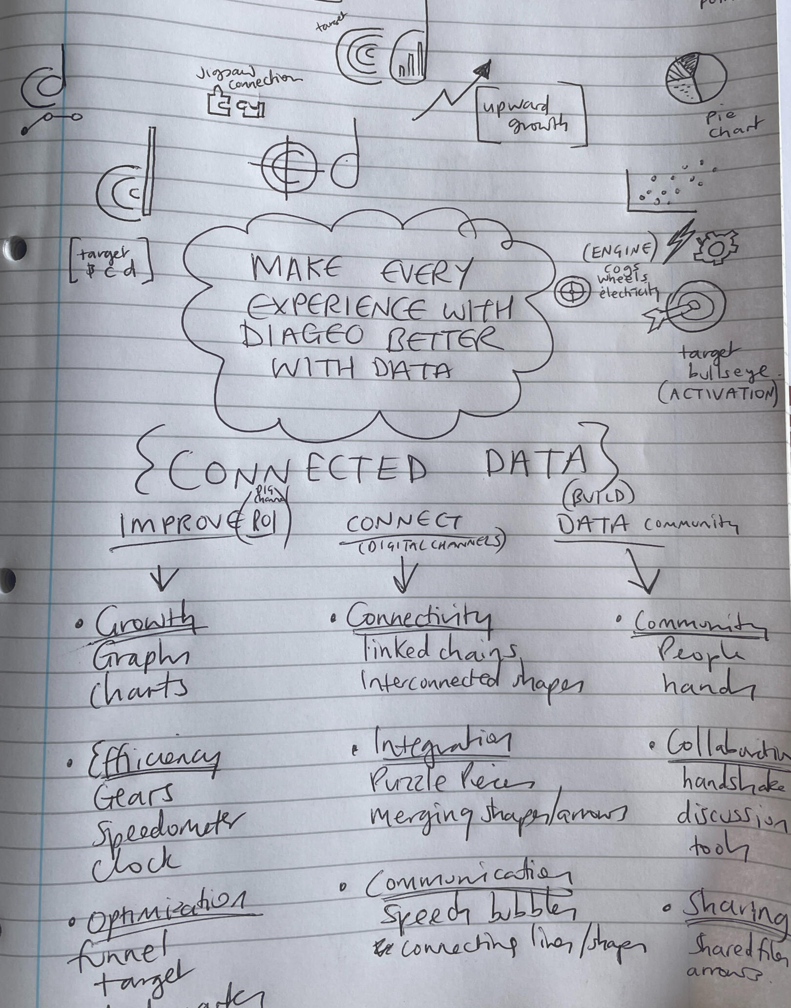
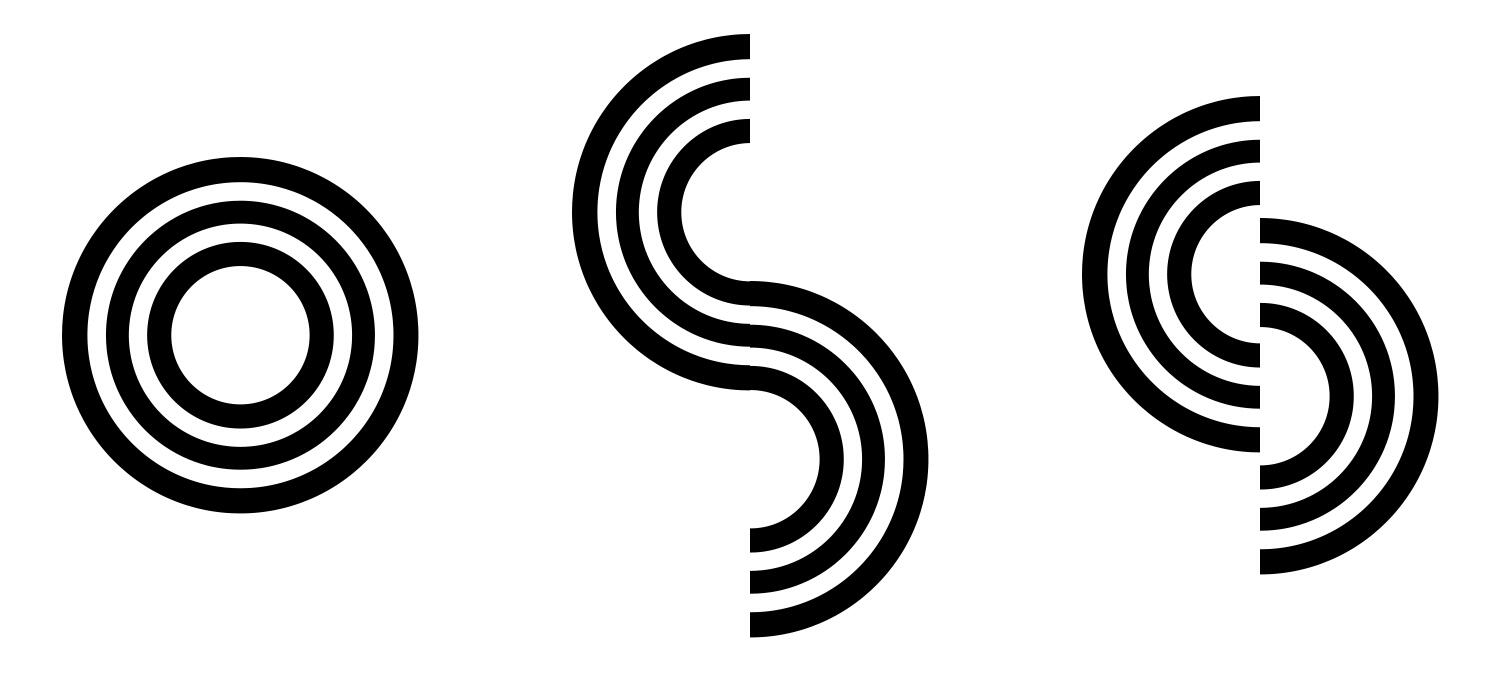
I was inspired by initial conversations with the stakeholders. The repeated use of the phrase 'target consumers' put the consumer as the focus of project, and conjured up visions of dartboards with the consumer as the bullseye and atoms with the consumer as the nucleus.

Created digital prototypes of the master brand logo, sub-brand logos, and tertiary placeholders.Developed mockups of real-life applications (e.g. communication channels, zoom backgrounds, powerpoint presentations)Built a draft of the design system including guidelines for scalability and consistency.Shared prototypes with stakeholders and gather feedback.

Conducted usability tests with internal users to evaluate how easily the brand system is understood and applied.Tested scalability by applying the identity to hypothetical future sub-brands or features.Gathered feedback on clarity, appeal, and alignment with Diageo’s ethos.Iterated on the designs based on insights from testing.
Finalised all design elements including logos, guidelines, templates, and visual assets.Developed a comprehensive style guide for the master brand, sub-brands, and tertiary levels.Delivered training sessions and documentation to ensure consistent use across teams.Established a process for future updates or extensions to the brand identity.

UX DESIGN & UX RESEARCH CASE STUDY
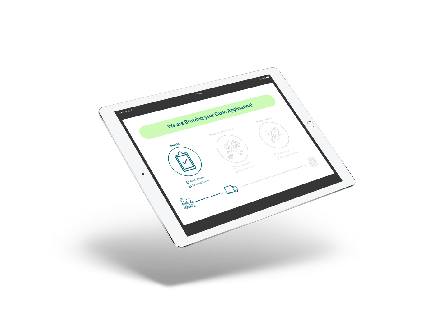
HEINEKEN | Eazle Ecommerce Platform
Eazle is Heineken's publican-facing ecommerce platform where they can purchase drinks and accessories for their pub.
PRODUCT DESIGN & UX/UI CASE STUDY
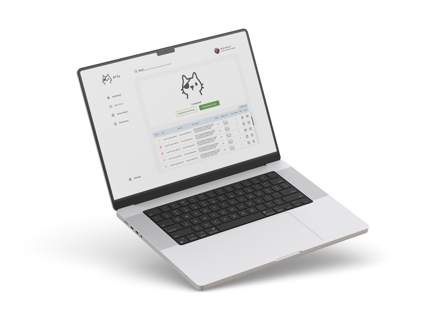
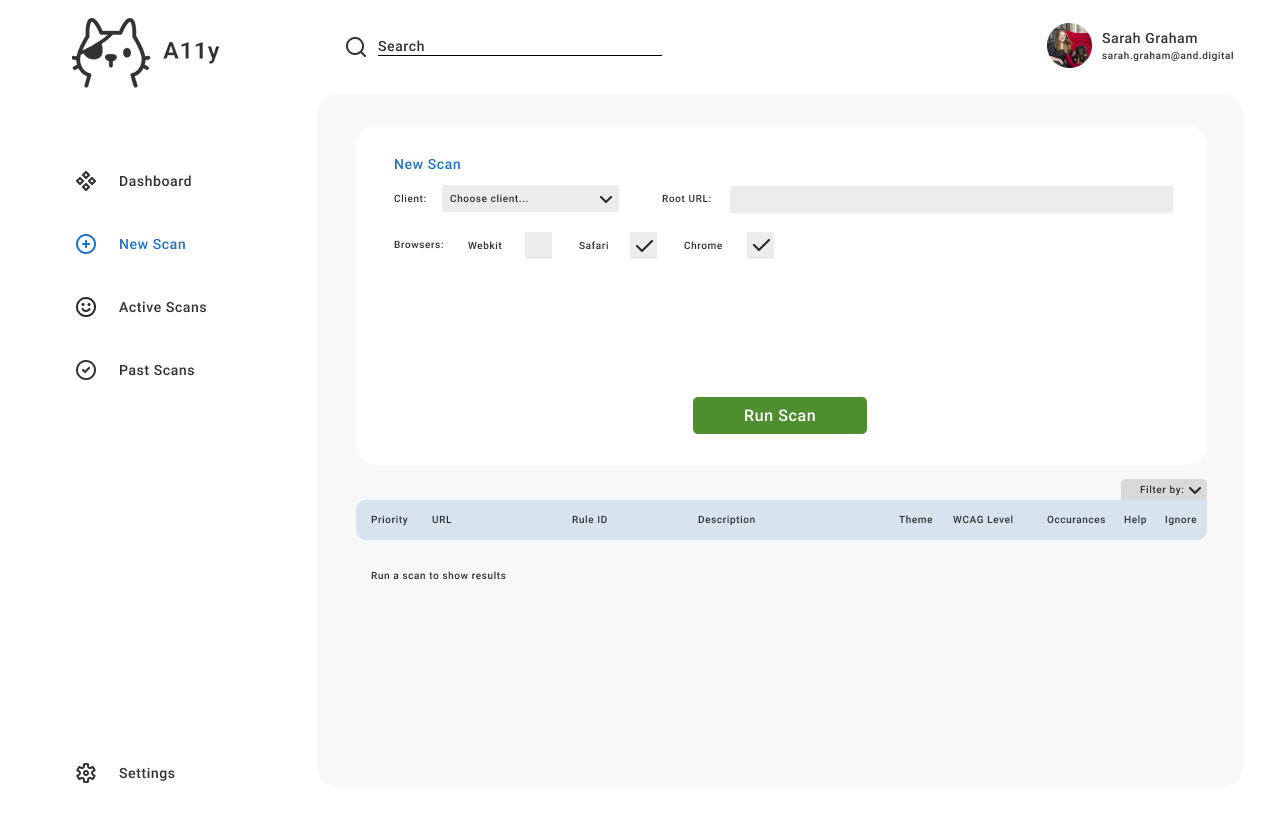
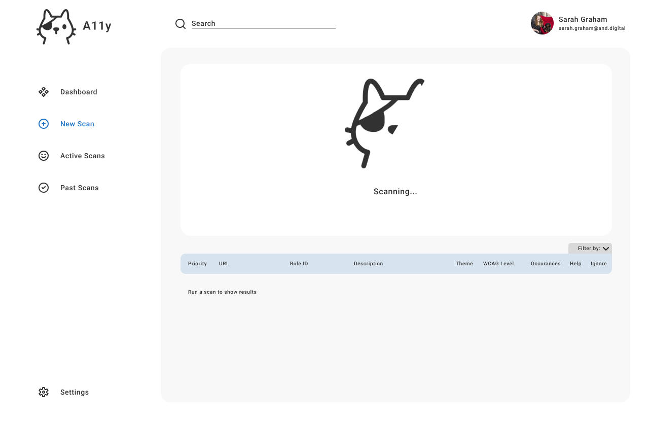
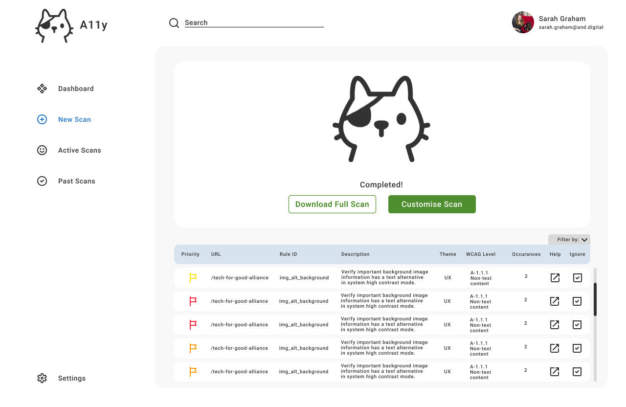
A11Y | Accessibility Testing Platform
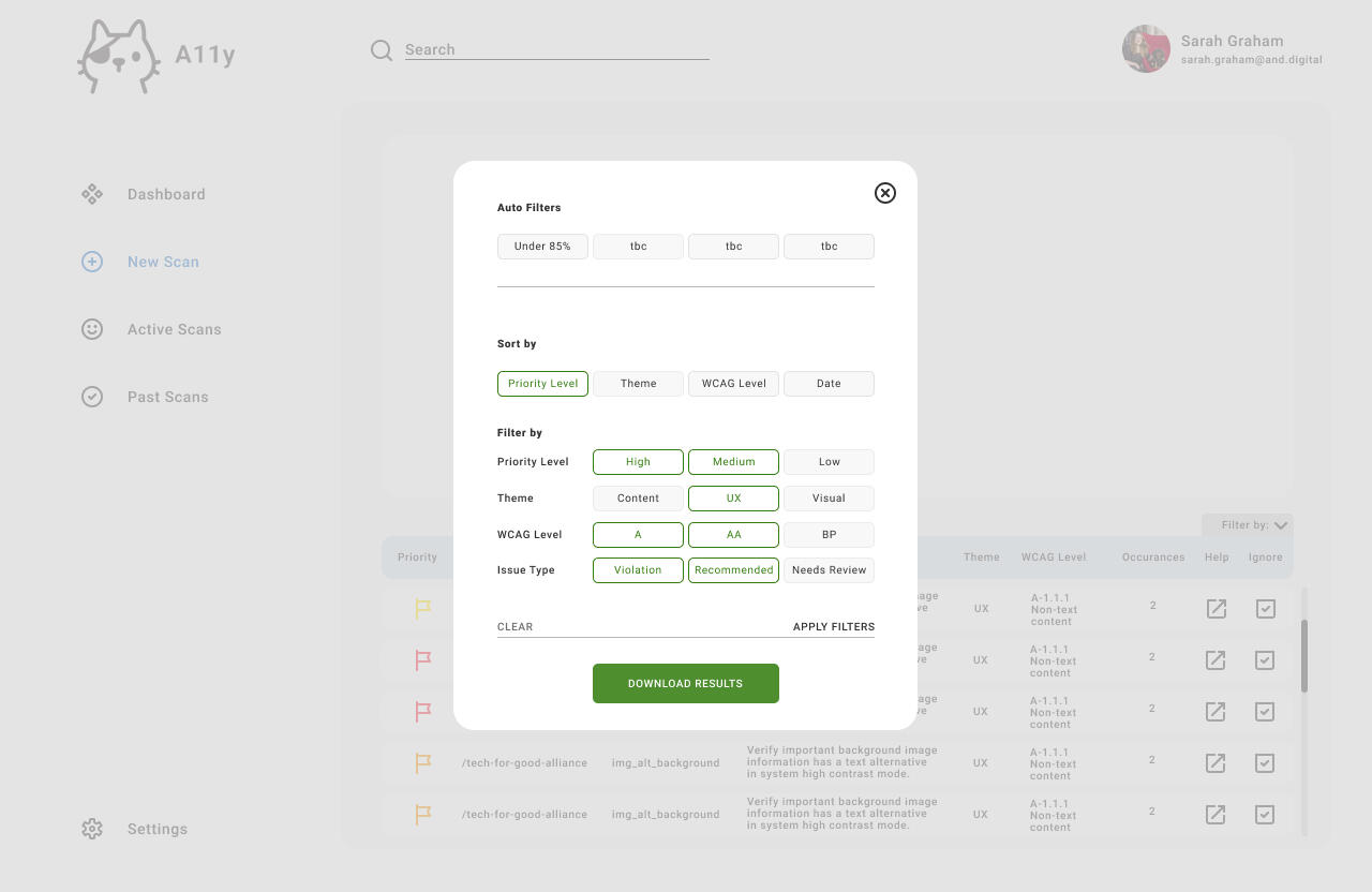
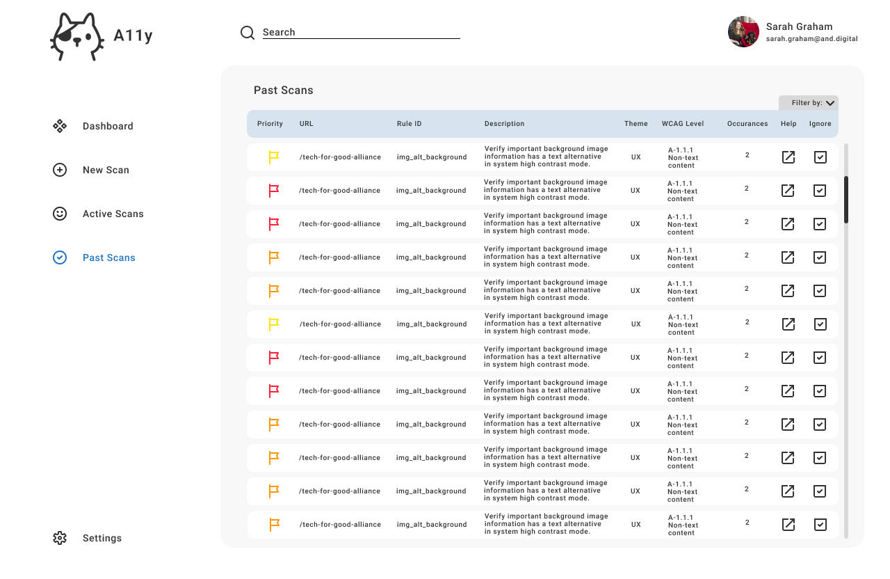
A11y is a platform used to perform accessibility audits of digital products and to generate recommendations inline with current WCGAG standards.
Role
Product DesignerProblem
AND Digital were looking to expand their client services to include offering accessibility assessments of existing digital products against current WCAG standards. The existing testing process, which involved tools like Google Lighthouse, Cypress Axe, and IBM, was labor-intensive and relied on manually compiling results into spreadsheets. This approach was inefficient and prone to errors, creating a need for a streamlined solution.Process
I conducted accessibility tests using the required tools and provided recommendations for improvement, which we later implemented. To address the inefficiencies of the testing process, I designed and developed an in-house Accessibility Platform called A11y. This platform automated testing, eliminated the need for separate tools, and generated clear, actionable reports. I was responsible for conducting user research, mapping user flows, and creating sketches, wireframes, and prototypes for the platform.Additionally, I designed the brand identity for A11y to ensure it aligned with the company’s mission and values. The logo features an alleycat persona that has sustained a visual impairment while fighting other cats, and is now on a quest to make digital products more accessible. This logo was cute and fun, and addressed feedback from testers that the process was dull and boring.Business Outcomes
The A11y platform significantly reduced the time and effort required for accessibility testing and reporting. It delivered actionable insights in a user-friendly format, enabling faster compliance with WCAG standards. The automation improved accuracy and efficiency, freeing up resources for other critical tasks. As a result, clients achieved improved website accessibility and compliance, enhancing the online experience for all users.


UX DESIGN CASE STUDY
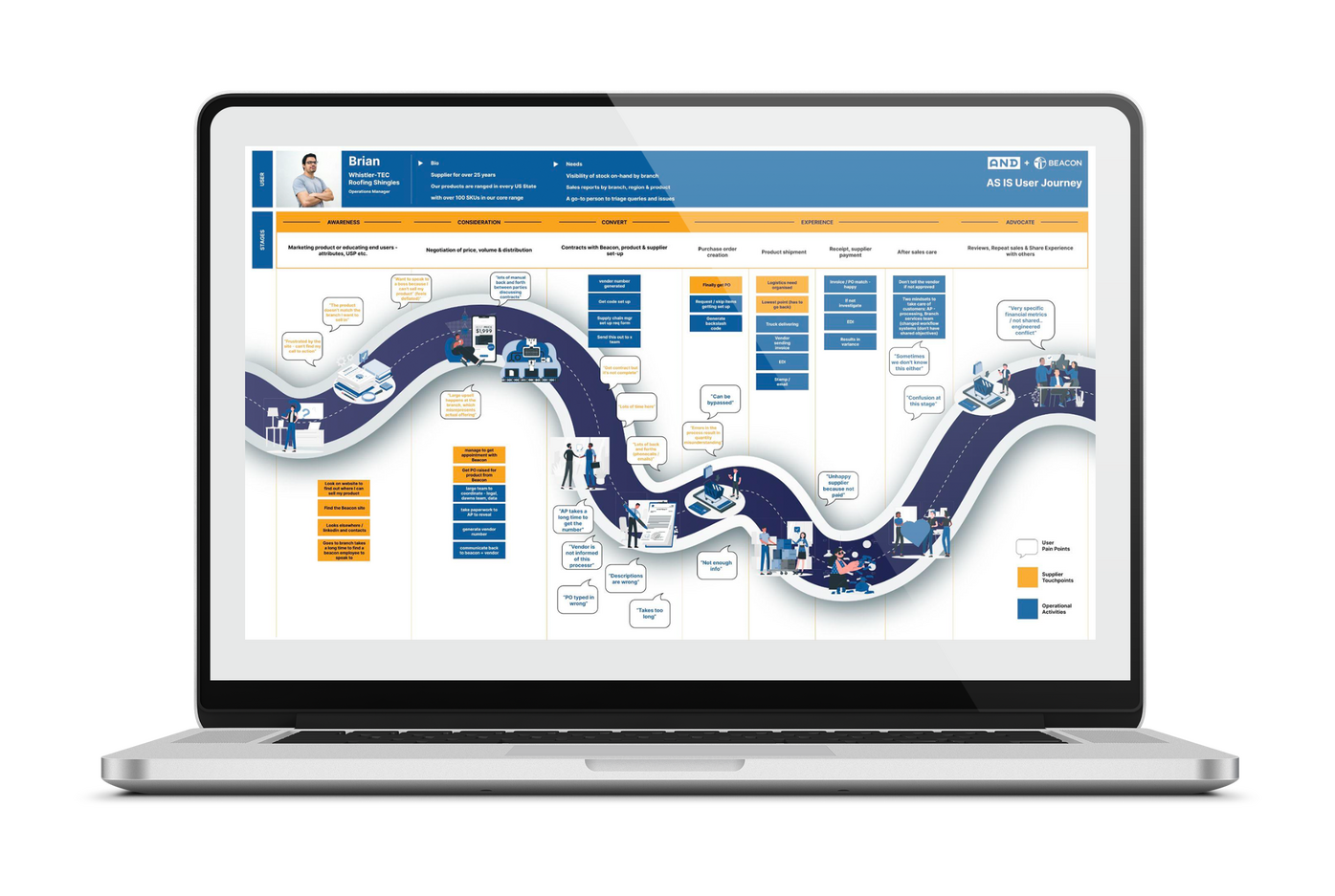
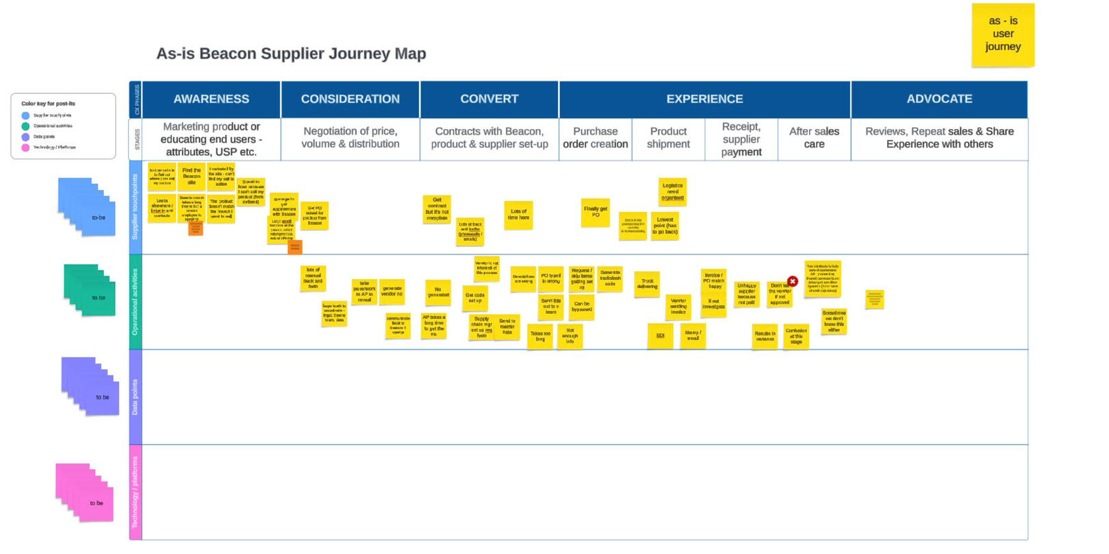
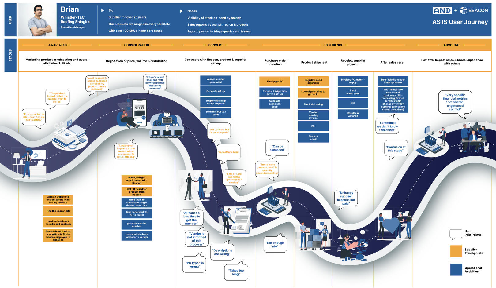
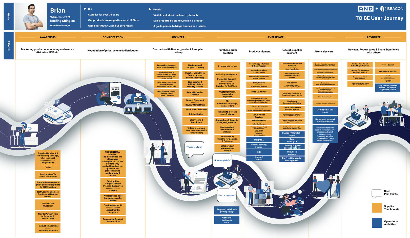
BEACON | Ecommerce Platform
Beacon are one of the largest roofing suppliers in the USA.
Role
UX DesignerProblem
Beacon, the largest roofing supplies company in the US, required As-Is and To-Be User Journey Maps to visualise and streamline their customer experience. They needed a solution to transform extensive existing research into an engaging and digestible format that could effectively inform their strategic decisions.Process
The project began with a deep dive into Beacon's existing research to extract key insights and pain points across the customer journey. I organised and synthesised this information to highlight the most critical aspects of the As-Is journey. Using these findings, I collaborated with stakeholders to envision the To-Be state, ensuring alignment with Beacon’s business goals. I designed the journey maps to present complex data in a visually intuitive and accessible way, incorporating clear narratives and actionable insights to guide improvements. Using colour to differentiate between user pain points, supplier touchpoints and operational activities was crucial for readability.Business Outcomes
The User Journey Maps provided Beacon with a comprehensive understanding of their customer experience. They facilitated cross-team collaboration, enabling stakeholders to identify pain points and prioritise improvements effectively. The maps served as a strategic tool to drive customer-centric decisions, ultimately enhancing user satisfaction and supporting Beacon's business growth.
MOTION DESIGN CASE STUDY
TOTAL ENERGIES | SVM
Total Energies is an energy brand.

Role
Motion DesignerProblem
Total Energies needed a motion graphic for their internal product, SVM, to effectively communicate its role within the ecosystem. The existing logo featured a chain link with three light sparks symbolizing interconnectedness and the generation of ideas. The challenge was to animate this concept in a way that emphasized the product's significance and fit seamlessly with the brand's visual identity.Process
I began by analysing the existing logo to understand its symbolism and core message. Drawing from this, I developed storyboards to map out the animation, ensuring it conveyed the chain link’s connection and the sparks’ dynamic representation of innovation. Using Adobe After Effects, I created a smooth and engaging animation that emphasised the flow and interconnectivity of SVM within the ecosystem. Throughout the process, I collaborated with stakeholders to refine the motion graphic and ensure alignment with their expectations and brand guidelines.Business Outcomes
The final motion graphic successfully captured the essence of SVM, visually reinforcing its role within Total Energies’ ecosystem. It was well-received by internal teams and enhanced the clarity of communications about the product. The animation also contributed to a cohesive and professional representation of SVM, supporting engagement and alignment across the organisation.

UX DESIGN & UX RESEARCH CASE STUDY
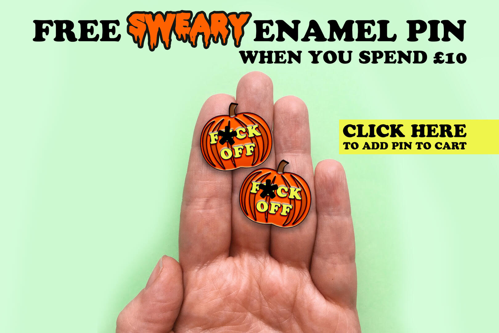
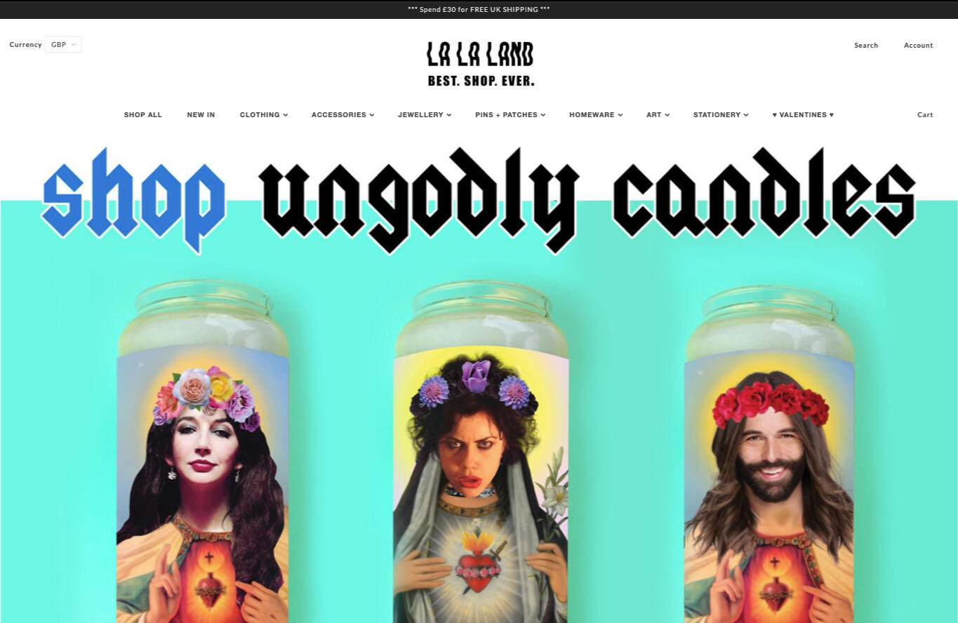
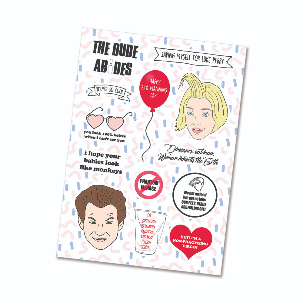
LA LA LAND | Ecommerce Platform
LA LA LAND is a gift and lifestyle brand.

Role
Lead Designer (and Founder)Problem
Running La La Land, a one-woman gift and lifestyle online shop for 12 years, required managing all aspects of the business independently. The challenge was to create a compelling and cohesive brand identity, design and produce a wide range of products, and establish a strong online presence to attract and retain customers in a competitive e-commerce landscape while optimising performance metrics such as conversion rates, bounce rates, and SEO.Process
I developed the brand from the ground up, starting with the name and logo and expanding to a full suite of visual assets. For product design, I created diverse items, including art prints, t-shirts, mugs, candles, homeware, and accessories, manufacturing them in-house or coordinating with external suppliers. To establish an online presence, I explored various e-commerce platforms before selecting Shopify, where I designed and maintained the website, including hero images and other visuals.To improve performance, I conducted user research to identify pain points in the customer journey, optimizing the website to streamline navigation and reduce bounce rates. I performed A/B testing on specific pages to refine layouts and calls-to-action, resulting in increased conversion rates. I optimized the site’s SEO strategy, ensuring improved visibility and traffic from search engines. Email marketing was a key focus, where I designed templates and tested them with consumers to boost open rates, click-through rates, and conversion rates. Social media content, including animations, videos, and photographs, was crafted to enhance engagement and drive traffic.Business Outcomes
La La Land grew into a successful online business with a loyal customer base and a recognisable brand identity. Website optimisations reduced bounce rates and increased conversion rates, while SEO improvements drove consistent organic traffic. User research and A/B testing enhanced the overall customer journey, improving satisfaction and repeat purchases. Email campaigns achieved higher-than-average open and click-through rates, further boosting sales. The experience honed my skills in product design, branding, web design, and data-driven optimisation, providing a strong foundation for roles in UX and Product Design.

VARIOUS SMEs | SQUARESPACE WEB DESIGN & TRAINING

Role
Web DesignerProblem
...Process
...Business Outcomes
...
